Correlation network_plot() with corrr
Looking for patterns or clusters in your correlation matrix? Spot them quickly using network_plot() in the latest development version of the corrr package!
# Install the development version of corrr
install.packages("devtools")
devtools::install_github("drsimonj/corrr")
library(corrr)
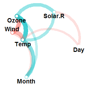
airquality %>% correlate() %>% network_plot(min_cor = .1)
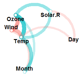
From this, we can instantly see how the variables are clustering, and glean the signs and relative magnitudes of the correlations. Let’s go into a bit of detail below.
The starting point: correlations #
The purpose of network_plot() is to help explore correlations through visualisation. What we often look for in correlations between many variables are patterns, or variable clustering, that indicate the potential for dimension reduction. Eventually, we can apply models to these results to investigate this for us (e.g., factor analysis). Still, it’s always good to keep an eye on the correlations themselves, but this can be challenging.
We’ll use the airquality data set for this example, which contains “Daily air quality measurements in New York, May to September 1973”. To learn more, run ?airquality from your console. Here’s a quick look:
head(airquality)
#>   Ozone Solar.R Wind Temp Month Day
#> 1    41     190  7.4   67     5   1
#> 2    36     118  8.0   72     5   2
#> 3    12     149 12.6   74     5   3
#> 4    18     313 11.5   62     5   4
#> 5    NA      NA 14.3   56     5   5
#> 6    28      NA 14.9   66     5   6
Next, let’s look at the correlations among the variables using correlate() from the corrr package. We’ll fashion() the correlations for pleasant viewing:
airquality %>% correlate() %>% fashion()
#>   rowname Ozone Solar.R Wind Temp Month  Day
#> 1   Ozone           .35 -.60  .70   .16 -.01
#> 2 Solar.R   .35         -.06  .28  -.08 -.15
#> 3    Wind  -.60    -.06      -.46  -.18  .03
#> 4    Temp   .70     .28 -.46        .42 -.13
#> 5   Month   .16    -.08 -.18  .42       -.01
#> 6     Day  -.01    -.15  .03 -.13  -.01
Even with a small data set like airquality that has six variables, you can see that it takes some effort to find patterns in these correlations. So finding patterns when you have lots of variables can be a real challenge!
Before we move on, I’ll mention that one approach for visualising clustering among correlations is to combine rearrange() and rplot(). For a detailed explanation of this method, see my previous blog plot about rearranging correlations with corrr. However, although rearrange() and rplot() are useful, it keeps us in the mindset of looking at a correlation matrix because the plot shows us a point for each correlation.
The network plot #
network_plot() is a different way of visualising and exploring correlations. Let’s try it out on our airquality data:
airquality %>% correlate() %>% network_plot()
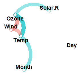
But what does this mean? Well, the plot shows a point for each variable rather than for each correlation. The proximity of the variables to each other represents the overall magnitude of their correlations. This way, we can literally see clusters of variables. For example, it’s immediately apparent from the above plot that the variables Ozone, Wind and Temp are clustering together (which makes sense). For the technically inclined, this positioning is handled by multidimensional scaling of the absolute values of the correlations.
Each path represents a correlation between the two variables that it joins. A blue path represents a positive correlation, and a red path represents a negative correlation. The width and transparency of the line represent the strength of the correlation (wider and less transparent = stronger correlation). For example, you can see that the positive correlation between Ozone and Temp is stronger than the positive correlation between Ozone and Solar.R.
You’ll notice that not all the possible paths are in the plot. That is, not all of our correlations are being visually represented. This is because only correlations of a certain magnitude (in absolute terms) or higher are plotted. By default, this magnitude is .30. So any paths that do not appear in the plot are correlations that are weaker than this (between -.30 and .30). The reason for this is so that we can visualise the strongest relationships while easily ignorning, or not being distracted by, the weakest ones. The good news is that it is possible to change this magnitude with the min_cor argument. This argument, which is set to .30 by default, determines the minimum correlation (in absolute terms) to plot as a path. For example, lowering this to .10 gives us:
airquality %>% correlate() %>% network_plot(min_cor = .1)
You can see that there are now more paths, which include, for example, the correlation of -.13 between Temp and Day. This is because all correlations with an absolute value of .10 or greater are now being plotted as paths.
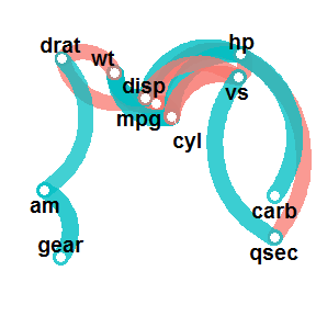
In some instances, we want to increase the min_cor to support our visualisation. For example, a default network_plot() of the mtcars data set is a bit overwhelming:
mtcars %>% correlate() %>% network_plot() # default: min_cor = .30

We can clean this up by increasing the min_cor, thus plotting fewer correlation paths:
mtcars %>% correlate() %>% network_plot(min_cor = .7)
Otherwise, that’s pretty much all there is to network_plot() at the moment. I’m hoping to release corrr version 0.2.0 soon, meaning that network_plot() will be available via straight install from CRAN (with install.packages("corrr")). So keep an eye out for new releases, but please get in touch with me if you have any suggestions or find any problems in the meantime.
Sign off #
Thanks for reading and I hope this was useful for you.
For updates of recent blog posts, follow @drsimonj on Twitter, or email me at drsimonjackson@gmail.com to get in touch.
If you’d like the code that produced this blog, check out my GitHub repository, blogR.