blogR

Walkthroughs and projects using R for data science.

Read this first

Label line ends in time series with ggplot2

@drsimonj here with a quick share on making great use of the secondary y axis with ggplot2 – super helpful if you’re plotting groups of time series!

Here’s an example of what I want to show you how to create (pay attention to the numbers of the right):

init-example-1.png

Setup

To setup we’ll need the tidyverse package and the Orange data set that comes with R. This tracks the circumference growth of five orange trees over time.

library(tidyverse)

d <- Orange

head(d)
> Grouped Data: circumference ~ age | Tree
>   Tree  age circumference
> 1    1  118            30
> 2    1  484            58
> 3    1  664            87
> 4    1 1004           115
> 5    1 1231           120
> 6    1 1372           142

Template code

To create the basic case where the numbers appear at the end of your time series lines, your code might look something like this:

 You have a data set with:
 - GROUP colum
 - X colum
...

Continue reading →


Exploring correlations in R with corrr

@drsimonj here to share a (sort of) readable version of my presentation at the amst-R-dam meetup on 14 August, 2018: “Exploring correlations in R with corrr”.

Those who attended will know that I changed the topic of the talk, originally advertised as “R from academia to commerical business”. For anyone who’s interested, I gave that talk at useR! 2018 and, thanks to the R consortium, you can watch it here. I also gave a “Wrangling data in the Tidyverse” tutorial that you can follow at Part 1 and Part 2.

The story of corrr

Moving to corrr — the first package I ever created. It started when I was a postgrad student studying individual differences in decision making. My research data was responses to test batteries. My statistical bread and butter was regression-based techniques like multiple regression, path analysis, factor analysis (EFA and CFA), and structural equation modelling.

I...

Continue reading →


Does financial support in Australia favour residents born elsewhere? Responding to racism with data

Seeing a racist outburst made me wonder whether the Australian Government unfairly supports people based on their background. Using data from the Australian Government and Bureau of Statistics, I couldn’t find compelling evidence of this being true. Don’t believe me? Read on and see what you make of the data.

Australian racism goes viral, again

Australian racism went viral again this year when a man was filmed abusing staff at Centrelink, which delivers social security payments and services to Australians (see story here). The man yells that he didn’t vote for multiculturalism and that Centrelink is supporting everyone except “Australians”. It is distressing to watch, especially as someone whose ancestors found a home in Australia having escaped persecution. He can’t take it back, but the man did publically apologise and may be suffering from mental illness (see story here).

This...

Continue reading →


Guide to tidy git analysis

@drsimonj here to help you embark on git repo analyses!

Ever wondered who contributes to git repos? How their contributions have changed over time? What sort of conventions different authors use in their commit messages? Maybe you were inspired by Mara Averick to contribute to tidyverse packages and wonder how you fit in?

This post – intended for intermediate R users – will help you answer these sorts of questions using tidy R tools.

Install and load these packages to follow along:

 Parts 1 and 2
library(tidyverse)
library(glue)
library(stringr)
library(forcats)

 Part 3
library(tidygraph)
library(ggraph)
library(tidytext)

Part 1: Git repo to a tidy data frame

Get a git repo

We’ll explore the open-source ggplot2 repo by copying it to our local machine with git clone, typically run on a command-line like:

git clone <repository_url> <directory>

Find the <repository_url> for...

Continue reading →


Creating corporate colour palettes for ggplot2

@drsimonj here to share how I create and reuse corporate color palettes for ggplot2.

You’ve started work as a data scientist at “drsimonj Inc” (congratulations, by the way) and PR have asked that all your Figures use the corporate colours. They send you the image below (coincidentally the Metro UI colors on color-hex.com):

corporate_swatch-1.png

You want to use these colours with ggplot2 while also making your code reusable and flexible.

Outline and setup

We’re going to create the following:

  1. Named vector of hex codes for the corporate colors
  2. Function to access hex codes (in 1)
  3. Named list of corporate color palettes (combinations of colors via 2)
  4. Function to access palettes (in 3)
  5. ggplot2-compatible scale functions that use the corporate palettes (via 4)

Load the ggplot2 package and set a default theme to setup:

library(ggplot2)

theme_set(theme_minimal())

Start with color

Everything starts...

Continue reading →


Five tips to improve your R code

@drsimonj here with five simple tricks I find myself sharing all the time with fellow R users to improve their code!

This post was originally published on DataCamp’s community as one of their top 10 articles in 2017

1. More fun to sequence from 1

Next time you use the colon operator to create a sequence from 1 like 1:n, try seq().

 Sequence a vector
x <- runif(10)
seq(x)
>  [1]  1  2  3  4  5  6  7  8  9 10

 Sequence an integer
seq(nrow(mtcars))
>  [1]  1  2  3  4  5  6  7  8  9 10 11 12 13 14 15 16 17 18 19 20 21 22 23
> [24] 24 25 26 27 28 29 30 31 32

The colon operator can produce unexpected results that can create all sorts of problems without you noticing! Take a look at what happens when you want to sequence the length of an empty vector:

 Empty vector
x <- c()

1:length(x)
> [1] 1 0

seq(x)
> integer(0)

You’ll also notice that this saves you from using functions like len...

Continue reading →


ggplot2 SEM models with tidygraph and ggraph

@drsimonj here to share a ggplot2-based function for plotting path analysis/structural equation models (SEM) fitted with Yves Rosseel’s lavaan package.

Background

SEM and its related methods (path analysis, confirmatory factor analysis, etc.) can be visualized as Directed Acyclic Graphs with nodes representing variables (observed or latent), and edges representing the specified relationships between them. For this reason, we will use Thomas Lin Pedersen’s tidygraph and ggraph packages. These packages work together to work with relational structures in a tidy format and plot them using ggplot2.

The function

Below is a function ggsem(), which takes a fitted lavaan object and returns a ggplot2 object representing the nodes, edges, and parameter values. It handles regression paths, correlations, latent factors, and factor loadings.

library(tidyverse)
library(tidygraph)
library(ggraph)
...

Continue reading →


Big Data Solutions: A/B t test

@drsimonj here to share my code for using Welch’s t-test to compare group means using summary statistics.

Motivation

I’ve just started working with A/B tests that use big data. Where once I’d whimsically run t.test(), now my data won’t fit into memory!

I’m sharing my solution here in the hope that it might help others.

In-memory data

As a baseline, let’s start with an in-memory case by comparing whether automatic and manual cars have different Miles Per Gallon ratings on average (using the mtcars data set).

t.test(mpg ~ am, data = mtcars)
> 
>  Welch Two Sample t-test
> 
> data:  mpg by am
> t = -3.7671, df = 18.332, p-value = 0.001374
> alternative hypothesis: true difference in means is not equal to 0
> 95 percent confidence interval:
>  -11.280194  -3.209684
> sample estimates:
> mean in group 0 mean in group 1 
>        17.14737        24.39231

Well… that was easy!

Big Data

...

Continue reading →


A tidy model pipeline with twidlr and broom

@drsimonj here to show you how to go from data in a data.frame to a tidy data.frame of model output by combining twidlr and broom in a single, tidy model pipeline.

The problem

Different model functions take different types of inputs (data.frames, matrices, etc) and produce different types of output! Thus, we’re often confronted with the very untidy challenge presented in this Figure:

problem.png

Thus, different models may need very different code.

However, it’s possible to create a consistent, tidy pipeline by combining the twidlr and broom packages. Let’s see how this works.

Two-step modelling

To understand the solution, think of the problem as a two-step process, depicted in this Figure:

two-step.png

Step 1: from data to fitted model

Step 1 must take data in a data.frame as input and return a fitted model object. twidlr exposes model functions that do just this!

To demonstrate:

...

Continue reading →


Pretty scatter plots with ggplot2

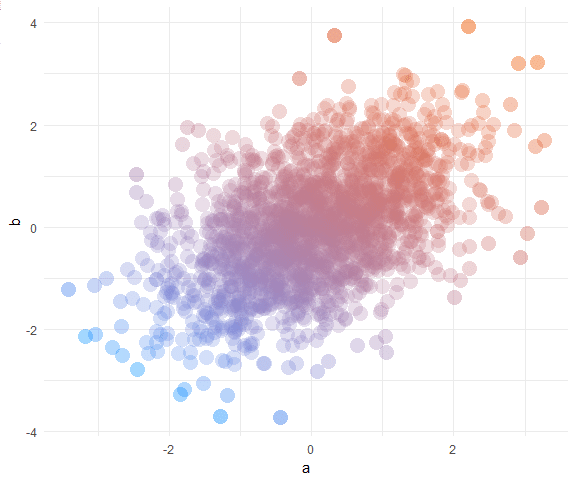
@drsimonj here to make pretty scatter plots of correlated variables with ggplot2!

We’ll learn how to create plots that look like this:

init-example-1.png

Data

In a data.frame d, we’ll simulate two correlated variables a and b of length n:

set.seed(170513)
n <- 200
d <- data.frame(a = rnorm(n))
d$b <- .4 * (d$a + rnorm(n))

head(d)
>            a           b
> 1 -0.9279965 -0.03795339
> 2  0.9133158  0.21116682
> 3  1.4516084  0.69060249
> 4  0.5264596  0.22471694
> 5 -1.9412516 -1.70890512
> 6  1.4198574  0.30805526

Basic scatter plot

Using ggplot2, the basic scatter plot (with theme_minimal) is created via:

library(ggplot2)

ggplot(d, aes(a, b)) +
  geom_point() +
  theme_minimal()

unnamed-chunk-3-1.JPEG

Shape and size

There are many ways to tweak the shape and size of the points. Here’s the combination I settled on for this post:

ggplot(d, aes(a, b)) +
  geom_point(shape = 16, size = 5) +
  theme_minimal()

unnamed-chunk-4-1.JPEG

C

...

Continue reading →