Label line ends in time series with ggplot2
@drsimonj here with a quick share on making great use of the secondary y axis with ggplot2 – super helpful if you’re plotting groups of time series!
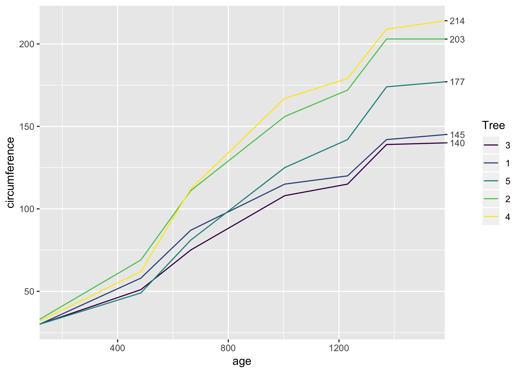
Here’s an example of what I want to show you how to create (pay attention to the numbers of the right):

Setup #
To setup we’ll need the tidyverse package and the Orange data set that comes with R. This tracks the circumference growth of five orange trees over time.
library(tidyverse)

d <- Orange

head(d)
#> Grouped Data: circumference ~ age | Tree
#>   Tree  age circumference
#> 1    1  118            30
#> 2    1  484            58
#> 3    1  664            87
#> 4    1 1004           115
#> 5    1 1231           120
#> 6    1 1372           142
Template code #
To create the basic case where the numbers appear at the end of your time series lines, your code might look something like this:
# You have a data set with:
# - GROUP colum
# - X colum (say time)
# - Y column (the values of interest)
DATA_SET

# Create a vector of the last (furthest right) y-axis values for each group
DATA_SET_ENDS <- DATA_SET %>%
  group_by(GROUP) %>%
  top_n(1, X) %>%
  pull(Y)

# Create plot with `sec.axis`
ggplot(DATA_SET, aes(X, Y, color = GROUP)) +
    geom_line() +
    scale_x_continuous(expand = c(0, 0)) +
    scale_y_continuous(sec.axis = sec_axis(~ ., breaks = DATA_SET_ENDS))
Let’s see it! #
Let’s break it down a bit. We already have our data set where the group colum is Tree, the X value is age, and the Y value is circumference.
So first get a vector of the last (furthest right) values for each group:
d_ends <- d %>%
  group_by(Tree) %>%
  top_n(1, age) %>%
  pull(circumference)

d_ends
#> [1] 145 203 140 214 177
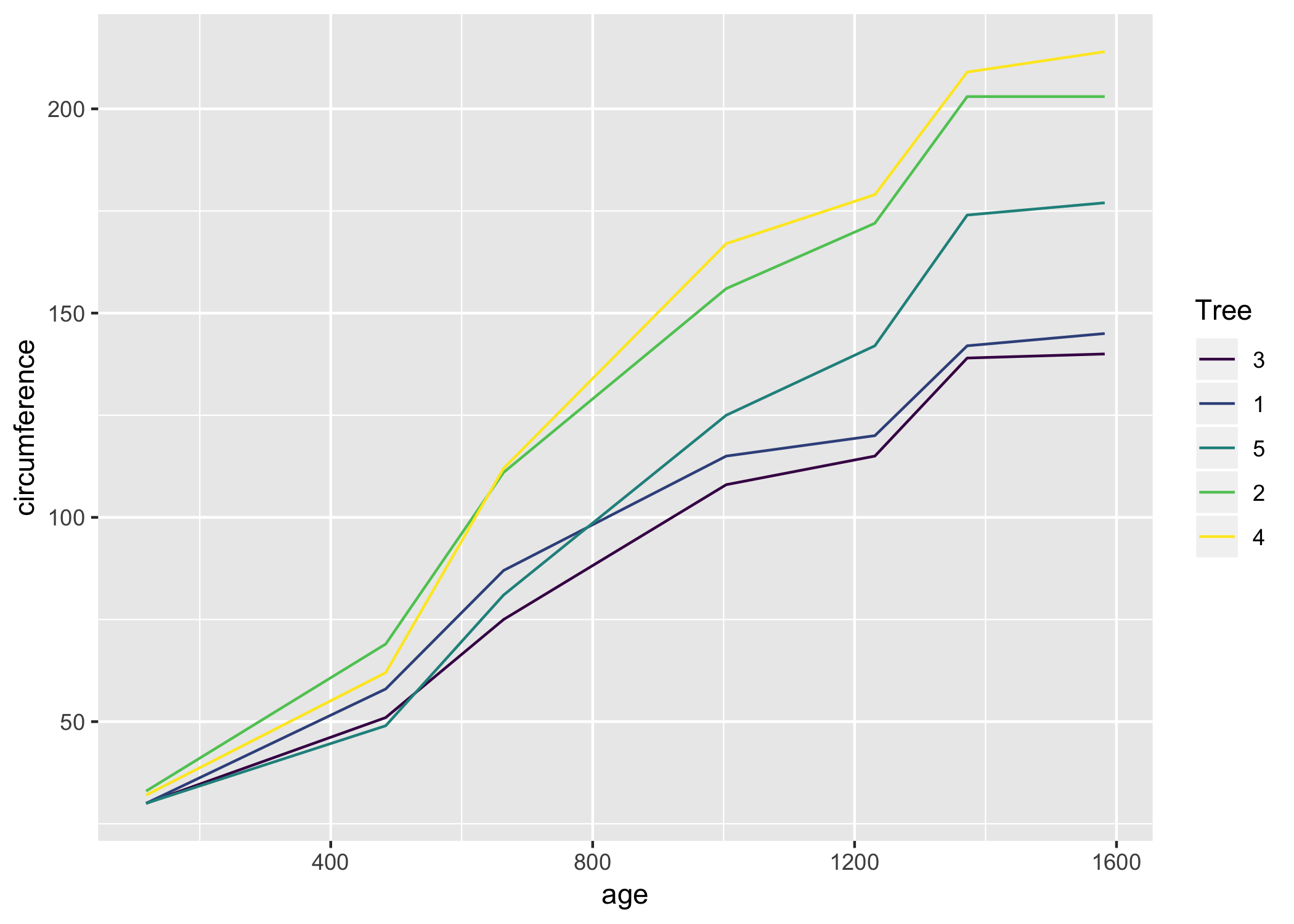
Next, let’s set up the basic plot without the numbers to see how each layer adds up.
ggplot(d, aes(age, circumference, color = Tree)) +
      geom_line()
Now we can use scale_y_*, with the argument sec.axis to create a second axis on the right, with numbers to be displayed at breaks, defined by our vector of line ends:
ggplot(d, aes(age, circumference, color = Tree)) +
      geom_line() +
      scale_y_continuous(sec.axis = sec_axis(~ ., breaks = d_ends))

This is a great start, The only major addition I suggest is expanding the margins of the x-axis so the gap disappears. You do this with scale_x_* and the expand argument:
ggplot(d, aes(age, circumference, color = Tree)) +
      geom_line() +
      scale_y_continuous(sec.axis = sec_axis(~ ., breaks = d_ends)) +
      scale_x_continuous(expand = c(0, 0))
Polishing it up #
Like it? Here’s the code to recreate the first polished plot:
library(tidyverse)

d <- Orange %>%
  as_tibble()

d_ends <- d %>%
  group_by(Tree) %>%
  top_n(1, age) %>%
  pull(circumference)

d %>%
  ggplot(aes(age, circumference, color = Tree)) +
    geom_line(size = 2, alpha = .8) +
    theme_minimal() +
    scale_x_continuous(expand = c(0, 0)) +
    scale_y_continuous(sec.axis = sec_axis(~ ., breaks = d_ends)) +
    ggtitle("Orange trees getting bigger with age",
            subtitle = "Based on the Orange data set in R") +
    labs(x = "Days old", y = "Circumference (mm)", caption = "Plot by @drsimonj")
Sign off #
Thanks for reading and I hope this was useful for you.
For updates of recent blog posts, follow @drsimonj on Twitter, or email me at drsimonjackson@gmail.com to get in touch.
If you’d like the code that produced this blog, check out the blogR GitHub repository.