Pretty scatter plots with ggplot2
@drsimonj here to make pretty scatter plots of correlated variables with ggplot2!
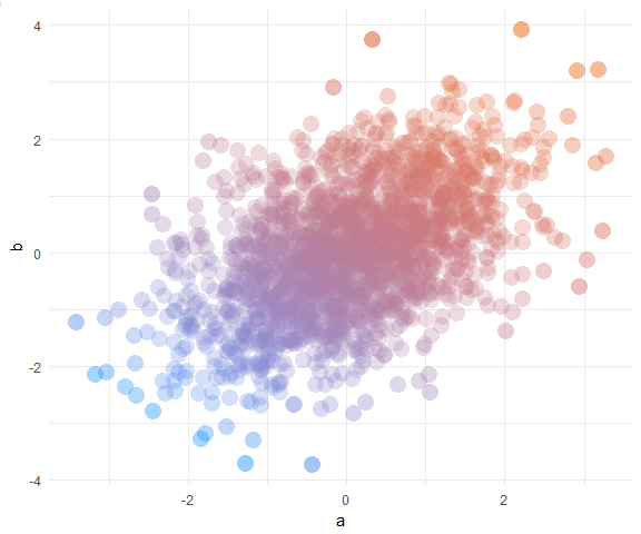
We’ll learn how to create plots that look like this:
Data #
In a data.frame d, we’ll simulate two correlated variables a and b of length n:
set.seed(170513)
n <- 200
d <- data.frame(a = rnorm(n))
d$b <- .4 * (d$a + rnorm(n))

head(d)
#>            a           b
#> 1 -0.9279965 -0.03795339
#> 2  0.9133158  0.21116682
#> 3  1.4516084  0.69060249
#> 4  0.5264596  0.22471694
#> 5 -1.9412516 -1.70890512
#> 6  1.4198574  0.30805526
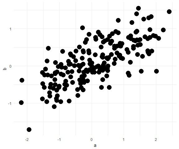
Basic scatter plot #
Using ggplot2, the basic scatter plot (with theme_minimal) is created via:
library(ggplot2)

ggplot(d, aes(a, b)) +
  geom_point() +
  theme_minimal()

Shape and size #
There are many ways to tweak the shape and size of the points. Here’s the combination I settled on for this post:
ggplot(d, aes(a, b)) +
  geom_point(shape = 16, size = 5) +
  theme_minimal()
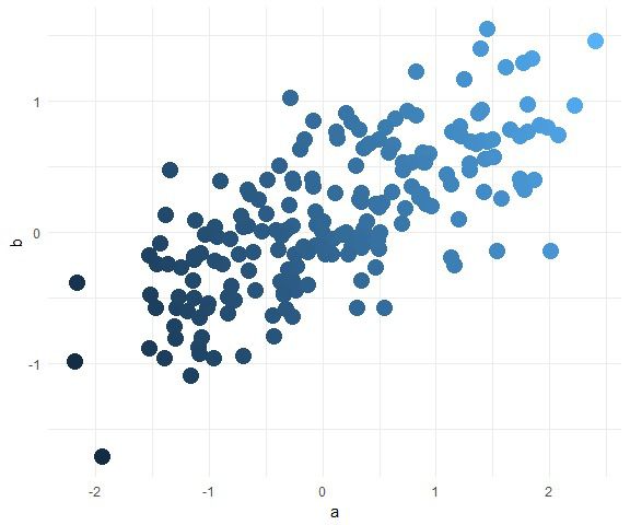
Color #
We want to color the points in a way that helps to visualise the correlation between them.
One option is to color by one of the variables. For example, color by a (and hide legend):
ggplot(d, aes(a, b, color = a)) +
  geom_point(shape = 16, size = 5, show.legend = FALSE) +
  theme_minimal()

Although it’s subtle in this plot, the problem is that the color is changing as the points go from left to right. Instead, we want the color to change in a direction that characterises the correlation - diagonally in this case.
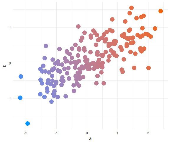
To do this, we can color points by the first principal component. Add it to the data frame as a variable pc and use it to color like so:
d$pc <- predict(prcomp(~a+b, d))[,1]

ggplot(d, aes(a, b, color = pc)) +
  geom_point(shape = 16, size = 5, show.legend = FALSE) +
  theme_minimal()
Now we can add color, let’s pick something nice with the help of the scale_color_gradient functions and some nice hex codes (check out color-hex for inspriation). For example:
ggplot(d, aes(a, b, color = pc)) +
  geom_point(shape = 16, size = 5, show.legend = FALSE) +
  theme_minimal() +
  scale_color_gradient(low = "#0091ff", high = "#f0650e")
Transparency #
Now it’s time to get rid of those offensive mushes by adjusting the transparency with alpha.
We could adjust it to be the same for every point:
ggplot(d, aes(a, b, color = pc)) +
  geom_point(shape = 16, size = 5, show.legend = FALSE, alpha = .4) +
  theme_minimal() +
  scale_color_gradient(low = "#0091ff", high = "#f0650e")

This is fine most of the time. However, what if you have many points? Let’s try with 5,000 points:
# Simulate data
set.seed(170513)
n <- 5000
d <- data.frame(a = rnorm(n))
d$b <- .4 * (d$a + rnorm(n))

# Compute first principal component
d$pc <- predict(prcomp(~a+b, d))[,1]

# Plot
ggplot(d, aes(a, b, color = pc)) +
  geom_point(shape = 16, size = 5, show.legend = FALSE, alpha = .4) +
  theme_minimal() +
  scale_color_gradient(low = "#0091ff", high = "#f0650e")
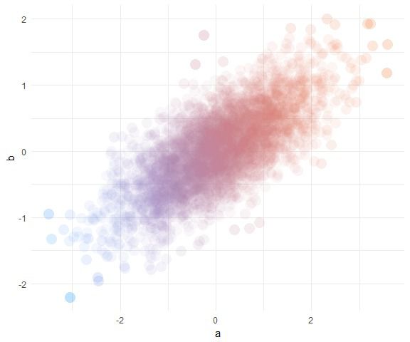
We’ve got another big mush. What if we take alpha down really low to .05?
ggplot(d, aes(a, b, color = pc)) +
  geom_point(shape = 16, size = 5, show.legend = FALSE, alpha = .05) +
  theme_minimal() +
  scale_color_gradient(low = "#0091ff", high = "#f0650e")

Better, except it’s now hard to see extreme points that are alone in space.
To solve this, we’ll map alpha to the inverse point density. That is, turn down alpha wherever there are lots of points! The trick is to use bivariate density, which can be added as follows:
# Add bivariate density for each point
d$density <- fields::interp.surface(
  MASS::kde2d(d$a, d$b), d[,c("a", "b")])
Now plot with alpha mapped to 1/density:
ggplot(d, aes(a, b, color = pc, alpha = 1/density)) +
  geom_point(shape = 16, size = 5, show.legend = FALSE) +
  theme_minimal() +
  scale_color_gradient(low = "#0091ff", high = "#f0650e")
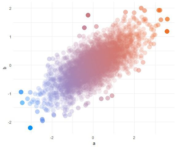
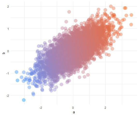
You can see that distant points are now too vibrant. Our final fix is to use scale_alpha to tweak the alpha range. By default, this range is 0 to 1, making the most distant points have an alpha close to 1. Let’s restrict it to something better:
ggplot(d, aes(a, b, color = pc, alpha = 1/density)) +
  geom_point(shape = 16, size = 5, show.legend = FALSE) +
  theme_minimal() +
  scale_color_gradient(low = "#0091ff", high = "#f0650e") +
  scale_alpha(range = c(.05, .25))
Much better! No more mushy patches or lost points.
Bringing it together #
Here’s a complete example with new data and colors:
# Simulate data
set.seed(170513)
n <- 2000
d <- data.frame(a = rnorm(n))
d$b <- -(d$a + rnorm(n, sd = 2))

# Add first principal component
d$pc <- predict(prcomp(~a+b, d))[,1]

# Add density for each point
d$density <- fields::interp.surface(
  MASS::kde2d(d$a, d$b), d[,c("a", "b")])

# Plot
ggplot(d, aes(a, b, color = pc, alpha = 1/density)) +
  geom_point(shape = 16, size = 5, show.legend = FALSE) +
  theme_minimal() +
  scale_color_gradient(low = "#32aeff", high = "#f2aeff") +
  scale_alpha(range = c(.25, .6))

Sign off #
Thanks for reading and I hope this was useful for you.
For updates of recent blog posts, follow @drsimonj on Twitter, or email me at drsimonjackson@gmail.com to get in touch.
If you’d like the code that produced this blog, check out the blogR GitHub repository.