blogR

Walkthroughs and projects using R for data science.

Page 4


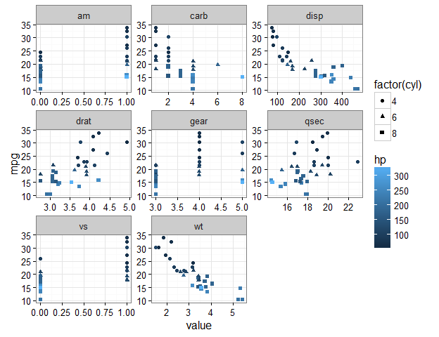
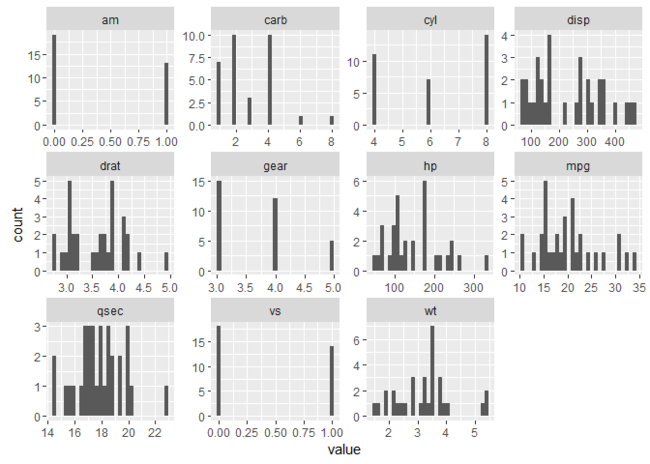
Plotting background data for groups with ggplot2

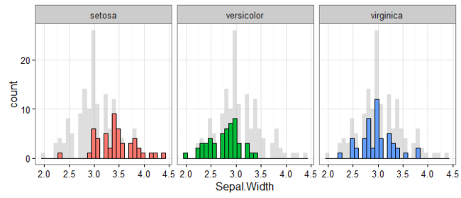
This tweet by mikefc alerted me to a mind-blowingly simple but amazing trick using the ggplot2 package: to visualise data for different groups in a facetted plot with all of the data plotted in the background. Here’s an example that we’ll learn to make in this post so you know what I’m talking about:

init-example-1.png

Credit where credit’s due

Before continuing, I’d be remiss for not mentioning that the origin of this ingenious suggestion is Hadley Wickham. The tip comes in his latest ggplot book, for which hardcopies are available online at places like Amazon, and the code and text behind it are freely available on Hadley’s Github at this repository.

Some motivating examples

Let’s start with some examples that explain just why I’m so excited about this trick. Consider wanting to plot the results shown in the example above. That is, for the iris data set (that comes with R), we want to plot a...

Continue reading →


focus() on correlations of some variables with many others

Get the correlations of one or more variables with many others using focus() from the corrr package:

library(corrr)
mtcars %>% correlate() %>% focus(mpg)
>  A tibble: 10 x 2
>    rowname        mpg
>      <chr>      <dbl>
> 1      cyl -0.8521620
> 2     disp -0.8475514
> 3       hp -0.7761684
> 4     drat  0.6811719
> 5       wt -0.8676594
> 6     qsec  0.4186840
> 7       vs  0.6640389
> 8       am  0.5998324
> 9     gear  0.4802848
> 10    carb -0.5509251

Let’s break it down.

Motivation

I’ve noticed a lot of people asking how to do this: see here, here, here.

So this post will explain how to use focus() from the corrr package to correlate one or more variables in a data frame with many others.

Starting with corrr

We’ll be using the corrr package, which starts by using correlate() to create a correlation data frame. For example, we can correlate() all columns in the mtcars data...

Continue reading →


fashion() output with corrr

Tired of trying to get your data to print right or formatting it in a program like excel? Try out fashion() from the corrr package:

d <- data.frame(
  gender = factor(c("Male", "Female", NA)),
  age    = c(NA, 28.1111111, 74.3),
  height = c(188, NA, 168.78906),
  fte    = c(NA, .78273, .9)
)
d
>   gender      age   height     fte
> 1   Male       NA 188.0000      NA
> 2 Female 28.11111       NA 0.78273
> 3   <NA> 74.30000 168.7891 0.90000

library(corrr)
fashion(d)
>   gender   age height  fte
> 1   Male       188.00     
> 2 Female 28.11         .78
> 3        74.30 168.79  .90

But how does it work and what does it do?

The inspiration: correlations and decimals

The insipration for fashion() came from my unending frustration at getting a correlation matrix to print out exactly how I wanted. For example, printing correlations typically looks something like:

mtcars %>% correlate()
>
...

Continue reading →


Plot some variables against many others with tidyr and ggplot2

Want to see how some of your variables relate to many others? Here’s an example of just this:

library(tidyr)
library(ggplot2)

mtcars %>%
  gather(-mpg, -hp, -cyl, key = "var", value = "value") %>% 
  ggplot(aes(x = value, y = mpg, color = hp, shape = factor(cyl))) +
    geom_point() +
    facet_wrap(~ var, scales = "free") +
    theme_bw()

init-example-1.png

This plot shows a separate scatter plot panel for each of many variables against mpg; all points are coloured by hp, and the shapes refer to cyl.

Let’s break it down.

Some previous advice

This post is an extension of a previous one that appears here: https://drsimonj.svbtle.com/quick-plot-of-all-variables.

In that prior post, I explained a method for plotting the univariate distributions of many numeric variables in a data frame. This post does something very similar, but with a few tweaks that produce a very useful result. So, in general...

Continue reading →


Correlation network_plot() with corrr

Looking for patterns or clusters in your correlation matrix? Spot them quickly using network_plot() in the latest development version of the corrr package!

 Install the development version of corrr
install.packages("devtools")
devtools::install_github("drsimonj/corrr")
library(corrr)
airquality %>% correlate() %>% network_plot(min_cor = .1)

posts-init-example-1.png

From this, we can instantly see how the variables are clustering, and glean the signs and relative magnitudes of the correlations. Let’s go into a bit of detail below.

The starting point: correlations

The purpose of network_plot() is to help explore correlations through visualisation. What we often look for in correlations between many variables are patterns, or variable clustering, that indicate the potential for dimension reduction. Eventually, we can apply models to these results to investigate this for us (e.g., factor analysis). Still...

Continue reading →


Line plot for two-way designs using ggplot2

Want to use R to plot the means and compare differences between groups, but don’t know where to start? This post is for you.

As usual, let’s start with a finished example:

library(dplyr)
library(ggplot2)

pd <- position_dodge(width = 0.2)
mtcars %>%
  mutate(cyl = factor(cyl), am = factor(am, labels = c("automatic", "manual"))) %>% 
  group_by(cyl, am) %>% 
  summarise(hp_mean = mean(hp),
            hp_ci   = 1.96 * sd(hp)/sqrt(n())) %>% 
  ggplot(aes(x = cyl, y = hp_mean, group = am)) +
    geom_line(aes(linetype = am), position = pd) +
    geom_errorbar(aes(ymin = hp_mean - hp_ci, ymax = hp_mean + hp_ci),
                  width = .1, position = pd, linetype = 1) +
    geom_point(size = 4, position = pd) +
    geom_point(size = 3, position = pd, color = "white") +
    guides(linetype = guide_legend("Transmission")) +
    labs(title = paste("Mean horsepower depending on",
...

Continue reading →


rearrange() your correlations with corrr

Don’t stare at your correlations in search of variable clusters when you can rearrange() them:

library(corrr)
mtcars %>% correlate() %>% rearrange() %>% fashion()
>    rowname   am gear drat   wt disp  mpg  cyl   vs   hp carb qsec
> 1       am       .79  .71 -.69 -.59  .60 -.52  .17 -.24  .06 -.23
> 2     gear  .79       .70 -.58 -.56  .48 -.49  .21 -.13  .27 -.21
> 3     drat  .71  .70      -.71 -.71  .68 -.70  .44 -.45 -.09  .09
> 4       wt -.69 -.58 -.71       .89 -.87  .78 -.55  .66  .43 -.17
> 5     disp -.59 -.56 -.71  .89      -.85  .90 -.71  .79  .39 -.43
> 6      mpg  .60  .48  .68 -.87 -.85      -.85  .66 -.78 -.55  .42
> 7      cyl -.52 -.49 -.70  .78  .90 -.85      -.81  .83  .53 -.59
> 8       vs  .17  .21  .44 -.55 -.71  .66 -.81      -.72 -.57  .74
> 9       hp -.24 -.13 -.45  .66  .79 -.78  .83 -.72       .75 -.71
> 10    carb  .06  .27 -.09  .43  .39 -.55  .53 -.57
...

Continue reading →


Quick plot of all variables

This post will explain a data pipeline for plotting all (or selected types) of the variables in a data frame in a facetted plot. The goal is to be able to glean useful information about the distributions of each variable, without having to view one at a time and keep clicking back and forth through our plot pane!

For readers short of time, here’s an example of what we’ll be getting to:

library(purrr)
library(tidyr)
library(ggplot2)

mtcars %>%
  keep(is.numeric) %>% 
  gather() %>% 
  ggplot(aes(value)) +
    facet_wrap(~ key, scales = "free") +
    geom_histogram()

posts-example-1.png

For those with time, let’s break this down.

Selecting our variables with keep()

The first thing we want to do is to select our variables for plotting. There are many ways to do this. For the goal here (to glance at many variables), I typically use keep() from the purrr package. Let’s look at how keep() works as an...

Continue reading →


Explore correlations in R with corrr

Earlier this week, my first package, corrr, was made available on CRAN. Below are the introductory instructions provided on the README for this first-release version 0.1.0. Please contribute to corrr on Github or email me your suggestions!

corrr

corrr is a package for exploring correlations in R. It makes it possible to easily perform routine tasks when exploring correlation matrices such as ignoring the diagonal, focusing on the correlations of certain variables against others, or rearranging and visualising the matrix in terms of the strength of the correlations.

You can install:

  • the latest released version from CRAN with
install.packages("corrr")
  • the latest development version from github with
if (packageVersion("devtools") < 1.6) {
  install.packages("devtools")
}
devtools::install_github("drsimonj/corrr")

Using corrr

Using corrr starts with correlate(), which acts...

Continue reading →


Proportions with mean()

One of the most common tasks I want to do is calculate the proportion of observations (e.g., rows in a data set) that meet a particular condition. For example, what is the proportion of missing data, or people over the age of 18?

There is a suprisingly easy solution to handle this problem: by combining boolean vectors and mean().

Step 1: creating a boolean vector

We start with boolean vectors, which is a vector that is TRUE whenever our observation meets our condition, or FALSE whenever it’s not. We create this boolean vector by submitting our observations to some sort of conditional statement (or relevant function like is.na()). Let’s take a look at a few examples:

x <- letters[1:10]
x == "b"   return a boolean vector which is TRUE whenver x is "b"
>  [1] FALSE  TRUE FALSE FALSE FALSE FALSE FALSE FALSE FALSE FALSE

x <- 1:10
x > 5   TRUE whenever x is greater than 5
>  [1] FALSE
...

Continue reading →