ggplot2 SEM models with tidygraph and ggraph
@drsimonj here to share a ggplot2-based function for plotting path analysis/structural equation models (SEM) fitted with Yves Rosseel’s lavaan package.
Background #
SEM and its related methods (path analysis, confirmatory factor analysis, etc.) can be visualized as Directed Acyclic Graphs with nodes representing variables (observed or latent), and edges representing the specified relationships between them. For this reason, we will use Thomas Lin Pedersen’s tidygraph and ggraph packages. These packages work together to work with relational structures in a tidy format and plot them using ggplot2.
The function #
Below is a function ggsem(), which takes a fitted lavaan object and returns a ggplot2 object representing the nodes, edges, and parameter values. It handles regression paths, correlations, latent factors, and factor loadings.
library(tidyverse)
library(tidygraph)
library(ggraph)
library(lavaan)
# Plot a fitted lavaan object
ggsem <- function(fit, layout = "sugiyama") {

  # Extract standardized parameters
  params <- lavaan::standardizedSolution(fit)

  # Edge properties
  param_edges <- params %>%
    filter(op %in% c("=~", "~", "~~"), lhs != rhs, pvalue < .10) %>%
    transmute(to = lhs,
              from = rhs,
              val = est.std,
              type = dplyr::case_when(
                op == "=~" ~ "loading",
                op == "~"  ~ "regression",
                op == "~~" ~ "correlation",
                TRUE ~ NA_character_))

  # Identify latent variables for nodes
  latent_nodes <- param_edges %>%
    filter(type == "loading") %>%
    distinct(to) %>%
    transmute(metric = to, latent = TRUE)

  # Node properties
  param_nodes <- params %>%
    filter(lhs == rhs) %>%
    transmute(metric = lhs, e = est.std) %>%
    left_join(latent_nodes) %>%
    mutate(latent = if_else(is.na(latent), FALSE, latent))

  # Complete Graph Object
  param_graph <- tidygraph::tbl_graph(param_nodes, param_edges)

  # Plot
  ggraph(param_graph, layout = layout) +
    # Latent factor Nodes
    geom_node_point(aes(alpha = as.numeric(latent)),
                                     shape = 16, size = 5) +
    geom_node_point(aes(alpha = as.numeric(latent)),
                                     shape = 16, size = 4, color = "white") +
    # Observed Nodes
    geom_node_point(aes(alpha = as.numeric(!latent)),
                                     shape = 15, size = 5) +
    geom_node_point(aes(alpha = as.numeric(!latent)),
                                     shape = 15, size = 4, color = "white") +
    # Regression Paths (and text)
    geom_edge_link(aes(color = val, label = round(val, 2),
                       alpha = as.numeric(type == "regression")),
                   linetype = 1, angle_calc = "along", vjust = -.5,
                   arrow = arrow(20, unit(.3, "cm"), type = "closed")) +
    # Factor Loadings (no text)
    geom_edge_link(aes(color = val, alpha = as.numeric(type == "loading")),
                   linetype = 3, angle_calc = "along",
                   arrow = arrow(20, unit(.3, "cm"), ends = "first", type = "closed")) +
    # Correlation Paths (no text)
    geom_edge_link(aes(color = val, alpha = as.numeric(type == "correlation")),
                   linetype = 2, angle_calc = "along",
                   arrow = arrow(20, unit(.3, "cm"), type = "closed", ends = "both")) +
    # Node names
    geom_node_text(aes(label = metric),
                   nudge_y = .25, hjust = "inward") +
    # Node residual error
    geom_node_text(aes(label = sprintf("%.2f", e)),
                   nudge_y = -.1, size = 3) +
    # Scales and themes
    scale_alpha(guide = FALSE, range = c(0, 1)) +
    scale_edge_alpha(guide = FALSE, range = c(0, 1)) +
    scale_edge_colour_gradient2(guide = FALSE, low = "red", mid = "darkgray", high = "green") +
    scale_edge_linetype(guide = FALSE) +
    scale_size(guide = FALSE) +
    theme_graph()
}
To test this function, we’ll use the five, standardized variables from the diamonds data set:
d <- ggplot2::diamonds %>%
  select(x, y, z, carat, price) %>%
  mutate_all(funs((. - mean(.)) / sd(.)))
Path Analysis #
Let’s define a simple path model where diamond price is predicted by its carats, in turn, predicted by its x-axis length.
model <- ({"
    price ~ carat
    carat ~ x
"})

fit <- sem(model, data = d)

ggsem(fit)

Correlations #
We can also extend the model to include the y-axis length, which we assume to correlate with the x-axis length.
model <- ({"
    price ~ carat
    carat ~ x + y
    x ~~ y
"})

fit <- sem(model, data = d)

ggsem(fit)

Latent Factors #
We will now model the x, y, and z lengths as a latent “size” factor, which predicts carat
model <- ({"
    size =~ x + y + z

    price ~ carat
    carat ~ size
"})

fit <- sem(model, data = d)

ggsem(fit)

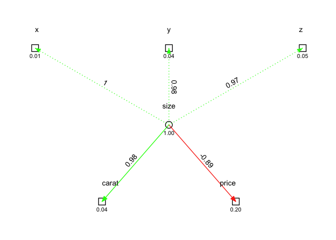
To compare, here we model “size” as a common underlying factor of carat and price:
model <- ({"
    size =~ x + y + z

    carat ~ size
    price ~ size

    price ~~ 0*carat
"})

fit <- sem(model, data = d)

ggsem(fit)

Color for strength and sign #
Edges are also colored based on parameter strength and sign. For example, let’s reverse score price and see how this appears:
d_rev <- d %>%
  mutate(price = max(price) - price)

fit <- sem(model, data = d_rev)

ggsem(fit)
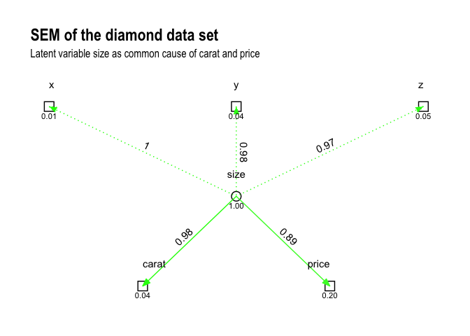
Back to ggplot2 #
By using ggraph, we can extend ggsem() with any ggplot2 syntax. For example, it’s easy to add a title:
ggsem(fit) +
    ggtitle("SEM of the diamond data set",
            subtitle = "Latent variable size as common cause of carat and price")
And, of course, you can always tweak the ggsem() function itself to achieve the desired result!
A note about semPlot #
For those who know about it, you might be asking why all this is necessary when we have Sacha Epskamp’s awesome semPlot package? There are likely many cases where semPlot will do a better job of laying out the nodes and edges.
For me, there were two reasons. One was a practical business reason. In my work, we operate using a shared R package library. Compared to semPlot, tidygraph and ggraph solve a broader range of relevant problems for us and are, therefore, available in our shared library. I can use semPlot locally, but prefer to work with packages that help me to collaborate faster at work. The other reason was control over aesthetics. semPlot is amazing, but it doesn’t allow for the sort of control over the graph aesthetics that tidygraph and ggraph provide.
Sign off #
Thanks for reading and I hope this was useful for you.
For updates of recent blog posts, follow @drsimonj on Twitter, or email me at drsimonjackson@gmail.com to get in touch.
If you’d like the code that produced this blog, check out the blogR GitHub repository.