How to create correlation network plots with corrr and ggraph (and which countries drink like Australia)
@drsimonj here to show you how to use ggraph and corrr to create correlation network plots like these:

ggraph and corrr #
The ggraph package by Thomas Lin Pedersen, has just been published on CRAN and it’s so hot right now! What does it do?
“ggraph is an extension of ggplot2 aimed at supporting relational data structures such as networks, graphs, and trees.”
A relational metric I work with a lot is correlations. Becuase of this, I created the corrr package, which helps to explore correlations by leveraging data frames and tidyverse tools rather than matrices.
So…
- corrr creates relational data frames of correlations intended to work with tidyverse tools like ggplot2.
- ggraph extends ggplot2 to help plot relational structures.
Seems like a perfect match!
Libraries #
We’ll be using the following libraries:
library(tidyverse)
library(corrr)
library(igraph)
library(ggraph)
Basic approach #
Given a data frame d of numeric variables for which we want to plot the correlations in a network, here’s a basic approach:
# Create a tidy data frame of correlations
tidy_cors <- d %>%
  correlate() %>%
  stretch()

# Convert correlations stronger than some value
# to an undirected graph object
graph_cors <- tidy_cors %>%
  filter(abs(r) > `VALUE_BETWEEN_0_AND_1`) %>%
  graph_from_data_frame(directed = FALSE)

# Plot
ggraph(graph_cors) +
  geom_edge_link() +
  geom_node_point() +
  geom_node_text(aes(label = name), repel = TRUE) +
  theme_graph()
Example 1: correlating variables in mtcars #
Let’s follow this for the mtcars data set. By default, all variables are numeric, so we don’t need to do any pre-processing.
We first create a tidy data frame of correlations to be converted to a graph object. We do this with two corrr functions: correlate(), to create a correlation data frame, and stretch(), to convert it into a tidy format:
tidy_cors <- mtcars %>%
  correlate() %>%
  stretch()

tidy_cors
#> # A tibble: 121 × 3
#>        x     y          r
#>    <chr> <chr>      <dbl>
#> 1    mpg   mpg         NA
#> 2    mpg   cyl -0.8521620
#> 3    mpg  disp -0.8475514
#> 4    mpg    hp -0.7761684
#> 5    mpg  drat  0.6811719
#> 6    mpg    wt -0.8676594
#> 7    mpg  qsec  0.4186840
#> 8    mpg    vs  0.6640389
#> 9    mpg    am  0.5998324
#> 10   mpg  gear  0.4802848
#> # ... with 111 more rows
Next, we convert these values to an undirected graph object. The graph is undirected because correlations do not have a direction. For example, correlations do not assume cause or effect. This is done using the igraph function, graph_from_data_frame(directed = FALSE).
Because, we typically don’t want to see ALL of the correlations, we first filter() out any correlations with an absolute value less than some threshold. For example, let’s include correlations that are .3 or stronger (positive OR negative):
graph_cors <- tidy_cors %>%
  filter(abs(r) > .3) %>%
  graph_from_data_frame(directed = FALSE)

graph_cors
#> IGRAPH UN-- 11 88 --
#> + attr: name (v/c), r (e/n)
#> + edges (vertex names):
#>  [1] mpg --cyl  mpg --disp mpg --hp   mpg --drat mpg --wt   mpg --qsec
#>  [7] mpg --vs   mpg --am   mpg --gear mpg --carb mpg --cyl  cyl --disp
#> [13] cyl --hp   cyl --drat cyl --wt   cyl --qsec cyl --vs   cyl --am
#> [19] cyl --gear cyl --carb mpg --disp cyl --disp disp--hp   disp--drat
#> [25] disp--wt   disp--qsec disp--vs   disp--am   disp--gear disp--carb
#> [31] mpg --hp   cyl --hp   disp--hp   hp  --drat hp  --wt   hp  --qsec
#> [37] hp  --vs   hp  --carb mpg --drat cyl --drat disp--drat hp  --drat
#> [43] drat--wt   drat--vs   drat--am   drat--gear mpg --wt   cyl --wt
#> + ... omitted several edges
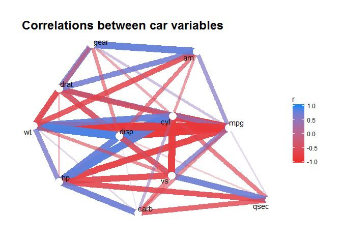
We now plot this object with ggraph. Here’s a basic plot:
ggraph(graph_cors) +
  geom_edge_link() +
  geom_node_point() +
  geom_node_text(aes(label = name))

and here’s one that’s polished to look nicer:
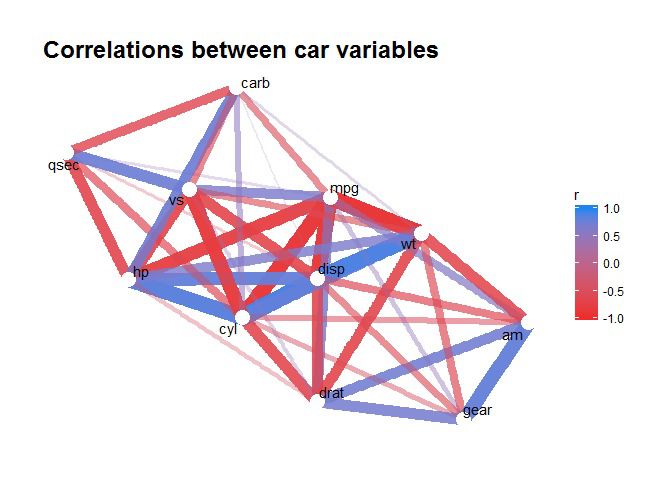
ggraph(graph_cors) +
  geom_edge_link(aes(edge_alpha = abs(r), edge_width = abs(r), color = r)) +
  guides(edge_alpha = "none", edge_width = "none") +
  scale_edge_colour_gradientn(limits = c(-1, 1), colors = c("firebrick2", "dodgerblue2")) +
  geom_node_point(color = "white", size = 5) +
  geom_node_text(aes(label = name), repel = TRUE) +
  theme_graph() +
  labs(title = "Correlations between car variables")
For an excellent resource on how these graphing parts work, Thomas has some great posts like this one on his blog, data-imaginist.com.
Example 2: countries with similar drinking habits #
This example requires some data pre-processing, and we’ll only look at strong positive correlations.
I’m about to finish my job in Australia and am looking for work elsewhere. As is typical of Australians, a friend suggested I look for work in countries where people drink like us. This is probably not the best approach for job hunting, but it makes for a fun example!
Conveniently, FiveThirtyEight did a story on the amount of beer, wine, and spirits, drunk by countries around the world. Even more conveniently, the data is included in the fivethirtyeight package! Let’s take a look:
library(fivethirtyeight)

drinks
#> # A tibble: 193 × 5
#>              country beer_servings spirit_servings wine_servings
#>                <chr>         <int>           <int>         <int>
#> 1        Afghanistan             0               0             0
#> 2            Albania            89             132            54
#> 3            Algeria            25               0            14
#> 4            Andorra           245             138           312
#> 5             Angola           217              57            45
#> 6  Antigua & Barbuda           102             128            45
#> 7          Argentina           193              25           221
#> 8            Armenia            21             179            11
#> 9          Australia           261              72           212
#> 10           Austria           279              75           191
#> # ... with 183 more rows, and 1 more variables:
#> #   total_litres_of_pure_alcohol <dbl>
I wanted to find which countries in Europe and the Americas had similar patterns of beer, wine, and spirit drinking, and where Australia fit in. Using the countrycode package to bind continent information and find the countries I’m interested, let’s get this data into shape for correlations:
library(countrycode)

# Get relevant data for Australia and countries
# in Europe and the Americas
d <- drinks %>%
  mutate(continent = countrycode(country, "country.name", "continent")) %>%
  filter(continent %in% c("Europe", "Americas") | country == "Australia") %>%
  select(country, contains("servings"))

# Scale data to examine relative amounts,
# rather than absolute volume, of
# beer, wine and spirits drunk
scaled_data <- d %>% mutate_if(is.numeric, scale)

# Tidy the data
tidy_data <- scaled_data %>%
  gather(type, litres, -country) %>%
  drop_na() %>%
  group_by(country) %>%
  filter(sd(litres) > 0) %>%
  ungroup()

# Widen into suitable format for correlations
wide_data <- tidy_data %>%
  spread(country, litres) %>%
  select(-type)

wide_data
#> # A tibble: 3 × 78
#>      Albania     Andorra `Antigua & Barbuda`   Argentina  Australia
#> *      <dbl>       <dbl>               <dbl>       <dbl>      <dbl>
#> 1 -1.0798330  0.68479335          -0.9327808  0.09658458  0.8657807
#> 2 -0.1146881 -0.04560957          -0.1607405 -1.34658934 -0.8054739
#> 3 -0.4577044  2.16796347          -0.5492974  1.24185582  1.1502628
#> # ... with 73 more variables: Austria <dbl>, Bahamas <dbl>,
#> #   Barbados <dbl>, Belarus <dbl>, Belgium <dbl>, Belize <dbl>,
#> #   Bolivia <dbl>, `Bosnia-Herzegovina` <dbl>, Brazil <dbl>,
#> #   Bulgaria <dbl>, Canada <dbl>, Chile <dbl>, Colombia <dbl>, `Costa
#> #   Rica` <dbl>, Croatia <dbl>, Cuba <dbl>, `Czech Republic` <dbl>,
#> #   Denmark <dbl>, Dominica <dbl>, `Dominican Republic` <dbl>,
#> #   Ecuador <dbl>, `El Salvador` <dbl>, Estonia <dbl>, Finland <dbl>,
#> #   France <dbl>, Germany <dbl>, Greece <dbl>, Grenada <dbl>,
#> #   Guatemala <dbl>, Guyana <dbl>, Haiti <dbl>, Honduras <dbl>,
#> #   Hungary <dbl>, Iceland <dbl>, Ireland <dbl>, Italy <dbl>,
#> #   Jamaica <dbl>, Latvia <dbl>, Lithuania <dbl>, Luxembourg <dbl>,
#> #   Macedonia <dbl>, Malta <dbl>, Mexico <dbl>, Moldova <dbl>,
#> #   Monaco <dbl>, Montenegro <dbl>, Netherlands <dbl>, Nicaragua <dbl>,
#> #   Norway <dbl>, Panama <dbl>, Paraguay <dbl>, Peru <dbl>, Poland <dbl>,
#> #   Portugal <dbl>, Romania <dbl>, `Russian Federation` <dbl>, `San
#> #   Marino` <dbl>, Serbia <dbl>, Slovakia <dbl>, Slovenia <dbl>,
#> #   Spain <dbl>, `St. Kitts & Nevis` <dbl>, `St. Lucia` <dbl>, `St.
#> #   Vincent & the Grenadines` <dbl>, Suriname <dbl>, Sweden <dbl>,
#> #   Switzerland <dbl>, `Trinidad & Tobago` <dbl>, Ukraine <dbl>, `United
#> #   Kingdom` <dbl>, Uruguay <dbl>, USA <dbl>, Venezuela <dbl>
This data includes the z-scores of the amount of beer, wine and spirits drunk in each country.
We can now go ahead with our standard approach. Because I’m only interested in which countries are really similar, we’ll filter(r > .9):

It looks like the drinking behaviour of these countries group into three clusters. I’ll leave it to you do think about what defines those clusters!
The important thing for my friend: Australia appears in the top left cluster along with many West and North European countries like the United Kingdom, France, Netherlands, Norway, and Sweden. Perhaps this is the region I should look for work if I want to keep up Aussie drinking habits!
Sign off #
Thanks for reading and I hope this was useful for you.
For updates of recent blog posts, follow @drsimonj on Twitter, or email me at drsimonjackson@gmail.com to get in touch.
If you’d like the code that produced this blog, check out the blogR GitHub repository.