Plot some variables against many others with tidyr and ggplot2
Want to see how some of your variables relate to many others? Here’s an example of just this:
library(tidyr)
library(ggplot2)

mtcars %>%
  gather(-mpg, -hp, -cyl, key = "var", value = "value") %>%
  ggplot(aes(x = value, y = mpg, color = hp, shape = factor(cyl))) +
    geom_point() +
    facet_wrap(~ var, scales = "free") +
    theme_bw()
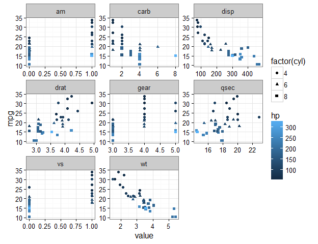
This plot shows a separate scatter plot panel for each of many variables against mpg; all points are coloured by hp, and the shapes refer to cyl.
Let’s break it down.
Some previous advice #
This post is an extension of a previous one that appears here: https://drsimonj.svbtle.com/quick-plot-of-all-variables.
In that prior post, I explained a method for plotting the univariate distributions of many numeric variables in a data frame. This post does something very similar, but with a few tweaks that produce a very useful result. So, in general, I’ll skip over a few minor parts that appear in the previous post (e.g., how to use purrr::keep() if you want only variables of a particular type).
Tidying our data #
As in the previous post, I’ll mention that you might be interested in using something like a for loop to create each plot. Personally, however, I think this is a messy way to do it. Instead, we’ll make use of the facet_wrap() function in the ggplot2 package, but doing so requires some careful data prep. Thus, assuming our data frame has all the variables we’re interested in, the first step is to get our data into a tidy form that is suitable for plotting.
We’ll do this using gather() from the tidyr package. In the previous post, we gathered all of our variables as follows (using mtcars as our example data set):
library(tidyr)
mtcars %>% gather() %>% head()
#>   key value
#> 1 mpg  21.0
#> 2 mpg  21.0
#> 3 mpg  22.8
#> 4 mpg  21.4
#> 5 mpg  18.7
#> 6 mpg  18.1
This gives us a key column with the variable names and a value column with their corresponding values. This works well if we only want to plot each variable by itself (e.g., to get univariate information).
However, here we’re interested in visualising multivariate information, with a particular focus on one or two variables. We’ll start with the bivariate case. Within gather(), we’ll first drop our variable of interest (say mpg) as follows:
mtcars %>% gather(-mpg, key = "var", value = "value") %>% head()
#>    mpg var value
#> 1 21.0 cyl     6
#> 2 21.0 cyl     6
#> 3 22.8 cyl     4
#> 4 21.4 cyl     6
#> 5 18.7 cyl     8
#> 6 18.1 cyl     6
We now have an mpg column with the values of mpg repeated for each variable in the var column. The value column contains the values corresponding to the variable in the var column. This simple extension is how we can use gather() to get our data into shape.
Creating the plot #
We now move to the ggplot2 package in much the same way we did in the previous post. We want a scatter plot of mpg with each variable in the var column, whose values are in the value column. Creating a scatter plot is handled by ggplot() and geom_point(). Getting a separate panel for each variable is handled by facet_wrap(). We also want the scales for each panel to be “free”. Otherwise, ggplot will constrain them all the be equal, which doesn’t make sense for plotting different variables. For a clean look, let’s also add theme_bw().
mtcars %>%
  gather(-mpg, key = "var", value = "value") %>%
  ggplot(aes(x = value, y = mpg)) +
    geom_point() +
    facet_wrap(~ var, scales = "free") +
    theme_bw()
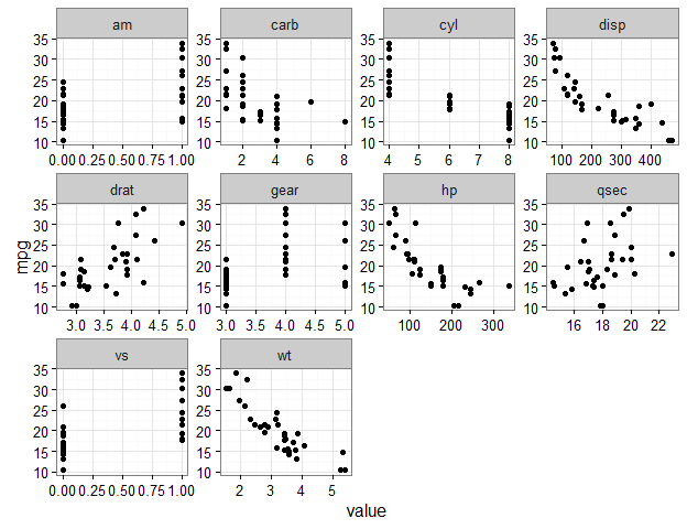
We now have a scatter plot of every variable against mpg. Let’s see what else we can do.
Extracting more than one variable #
We can layer other variables into these plots. For example, say we want to colour the points based on hp. To do this, we also drop hp within gather(), and then include it appropriately in the plotting stage:
mtcars %>%
  gather(-mpg, -hp, key = "var", value = "value") %>%
  head()
#>    mpg  hp var value
#> 1 21.0 110 cyl     6
#> 2 21.0 110 cyl     6
#> 3 22.8  93 cyl     4
#> 4 21.4 110 cyl     6
#> 5 18.7 175 cyl     8
#> 6 18.1 105 cyl     6

mtcars %>%
  gather(-mpg, -hp, key = "var", value = "value") %>%
  ggplot(aes(x = value, y = mpg, color = hp)) +
    geom_point() +
    facet_wrap(~ var, scales = "free") +
    theme_bw()
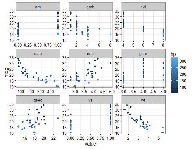
Let’s go crazy and change the point shape by cyl:
mtcars %>%
  gather(-mpg, -hp, -cyl, key = "var", value = "value") %>%
  head()
#>    mpg cyl  hp  var value
#> 1 21.0   6 110 disp   160
#> 2 21.0   6 110 disp   160
#> 3 22.8   4  93 disp   108
#> 4 21.4   6 110 disp   258
#> 5 18.7   8 175 disp   360
#> 6 18.1   6 105 disp   225

mtcars %>%
  gather(-mpg, -hp, -cyl, key = "var", value = "value") %>%
  ggplot(aes(x = value, y = mpg, color = hp, shape = factor(cyl))) +
    geom_point() +
    facet_wrap(~ var, scales = "free") +
    theme_bw()

Perks of ggplot2 #
If you’re familiar with ggplot2, you can go to town. For example, let’s add loess lines with stat_smooth():
mtcars %>%
  gather(-mpg, key = "var", value = "value") %>%
  ggplot(aes(x = value, y = mpg)) +
    geom_point() +
    stat_smooth() +
    facet_wrap(~ var, scales = "free") +
    theme_bw()
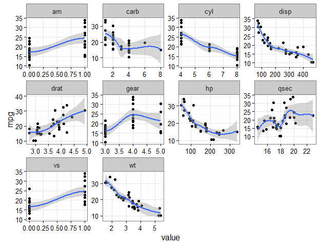
The options are nearly endless at this point, so I’ll stop here.
Sign off #
Thanks for reading and I hope this was useful for you.
For updates of recent blog posts, follow @drsimonj on Twitter, or email me at drsimonjackson@gmail.com to get in touch.
If you’d like the code that produced this blog, check out the blogR GitHub repository.