Quick plot of all variables
This post will explain a data pipeline for plotting all (or selected types) of the variables in a data frame in a facetted plot. The goal is to be able to glean useful information about the distributions of each variable, without having to view one at a time and keep clicking back and forth through our plot pane!
For readers short of time, here’s an example of what we’ll be getting to:
library(purrr)
library(tidyr)
library(ggplot2)

mtcars %>%
  keep(is.numeric) %>%
  gather() %>%
  ggplot(aes(value)) +
    facet_wrap(~ key, scales = "free") +
    geom_histogram()

For those with time, let’s break this down.
Selecting our variables with keep() #
The first thing we want to do is to select our variables for plotting. There are many ways to do this. For the goal here (to glance at many variables), I typically use keep() from the purrr package. Let’s look at how keep() works as an example.
keep() will take our data frame (as the first argument/via a pipe), and apply a predicate function to each of its columns. Columns that return TRUE in the function will be kept, while others will be dropped. In the example above, we saw is.numeric being used as the predicate function (note the necessary absence of parentheses). This means that only numeric columns will be kept, and all others excluded. Let’s see how this works after converting some columns in the mtcars data to factors.
d <- mtcars
d$vs <- factor(d$vs)
d$am <- factor(d$am)

d %>% str()
#> 'data.frame':    32 obs. of  11 variables:
#>  $ mpg : num  21 21 22.8 21.4 18.7 18.1 14.3 24.4 22.8 19.2 ...
#>  $ cyl : num  6 6 4 6 8 6 8 4 4 6 ...
#>  $ disp: num  160 160 108 258 360 ...
#>  $ hp  : num  110 110 93 110 175 105 245 62 95 123 ...
#>  $ drat: num  3.9 3.9 3.85 3.08 3.15 2.76 3.21 3.69 3.92 3.92 ...
#>  $ wt  : num  2.62 2.88 2.32 3.21 3.44 ...
#>  $ qsec: num  16.5 17 18.6 19.4 17 ...
#>  $ vs  : Factor w/ 2 levels "0","1": 1 1 2 2 1 2 1 2 2 2 ...
#>  $ am  : Factor w/ 2 levels "0","1": 2 2 2 1 1 1 1 1 1 1 ...
#>  $ gear: num  4 4 4 3 3 3 3 4 4 4 ...
#>  $ carb: num  4 4 1 1 2 1 4 2 2 4 ...

library(purrr)
d %>% keep(is.numeric) %>% head()
#>                    mpg cyl disp  hp drat    wt  qsec gear carb
#> Mazda RX4         21.0   6  160 110 3.90 2.620 16.46    4    4
#> Mazda RX4 Wag     21.0   6  160 110 3.90 2.875 17.02    4    4
#> Datsun 710        22.8   4  108  93 3.85 2.320 18.61    4    1
#> Hornet 4 Drive    21.4   6  258 110 3.08 3.215 19.44    3    1
#> Hornet Sportabout 18.7   8  360 175 3.15 3.440 17.02    3    2
#> Valiant           18.1   6  225 105 2.76 3.460 20.22    3    1
Notice how we’ve dropped the factor variables from our data frame. This is because they are not numeric. We can replace is.numeric for all sorts of functions (e.g., is.character, is.factor), but I find that is.numeric is what I use most.
So, we’ve narrowed our data frame down to numeric variables (or whichever variables we’re interested in). Let’s move on!
Tidying for plotting #
We now have a data frame of the columns we want to plot. Where to now? The first thing we might be tempted to do is use some sort of loop, and plot each column. Here’s some pseudo-code of what you might be tempted to do:
for (col in d) {
  # Plot col
}
The first problem with this is that we’ll get separate plots for each column, meaning we have to go back and forth between our plots (i.e., we can’t see them all at once). We could split up the plotting space using something like par(mfrow = ...), but this is a messy approach in my opinion. For example, we need to decide on how many rows and columns to plot, etc.
To achieve something similar (but without the headache), I like the idea of facet_wrap() provided in the plotting package, ggplot2. This function will plot multiple plot panels for us and automatically decide on the number of rows and columns (though we can specify them if we want).
The only problem is the way in which facet_wrap() works. Specifically, it expects one variable to inform it how to split the panels, and at least one other variable to contain the data to be plotted. Currently, we want to split by the column names, and each column holds the data to be plotted. So instead of two variables, we have many!
To handle this, we employ gather() from the package, tidyr. gather() will convert a selection of columns into two columns: a key and a value. The key contains the names of the original columns, and the value contains the data held in the columns. If we don’t specify any arguments for gather(), it will convert ALL columns in our data frame into key-value pairs. Let’s take a look while maintaining our pipeline:
library(tidyr)
d %>%
  keep(is.numeric) %>%
  gather() %>%
  head()
#>   key value
#> 1 mpg  21.0
#> 2 mpg  21.0
#> 3 mpg  22.8
#> 4 mpg  21.4
#> 5 mpg  18.7
#> 6 mpg  18.1
You can run this yourself, and you’ll notice that all numeric columns appear in key next to their corresponding values. We’re now in a position to use facet_wrap().
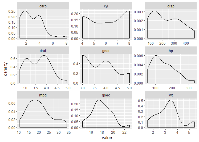
Creating the plot #
From here, we can produce our plot using ggplot2. We want to plot the value column – which is handled by ggplot(aes()) – in a separate panel for each key, dealt with by facet_wrap(). We also want the scales for each panel to be "free". Otherwise, ggplot will constrain them all the be equal, which generally doesn’t make sense for plotting different variables. The final addition is the geom mapping. In the first example, we asked for histograms with geom_histogram(). For variety, let’s use density plots with geom_density():
library(ggplot2)
d %>%
  keep(is.numeric) %>%                     # Keep only numeric columns
  gather() %>%                             # Convert to key-value pairs
  ggplot(aes(value)) +                     # Plot the values
    facet_wrap(~ key, scales = "free") +   # In separate panels
    geom_density()                         # as density
Sign off #
Thanks for reading and I hope this was useful for you.
For updates of recent blog posts, follow @drsimonj on Twitter, or email me at drsimonjackson@gmail.com to get in touch.
If you’d like the code that produced this blog, check out my GitHub repository, blogR.