Exploring the effects of healthcare investment on child mortality in R
@drsimonj here to investigate the effects of healthcare investment on child mortality rates over time. I hope that you find the content to be as equally interesting as I do. However, please note that this post is intended to be an informative exercise of exploring and visualizing data with R and my new ourworldindata package. The conclusions drawn here require independent, peer-reviewed verification.
On this note, thank you to Amanda Glassman for bringing this research paper to my attention after this post was first published. The paper suggests that healthcare expenditure does not, or weakly affects child mortality rates. I think it’s an excellent paper and, if you’re interested in the content, a far more legitimate resource in terms of the scientific approach taken. After reading that paper, with the exception of this paragraph, I’ve left this post unchanged for interested readers.
Healthcare expenditure correlates with child mortality #
This post was inspired by the Figure below which appears on this OurWorldInData.org page, managed by Max Roser and his team.
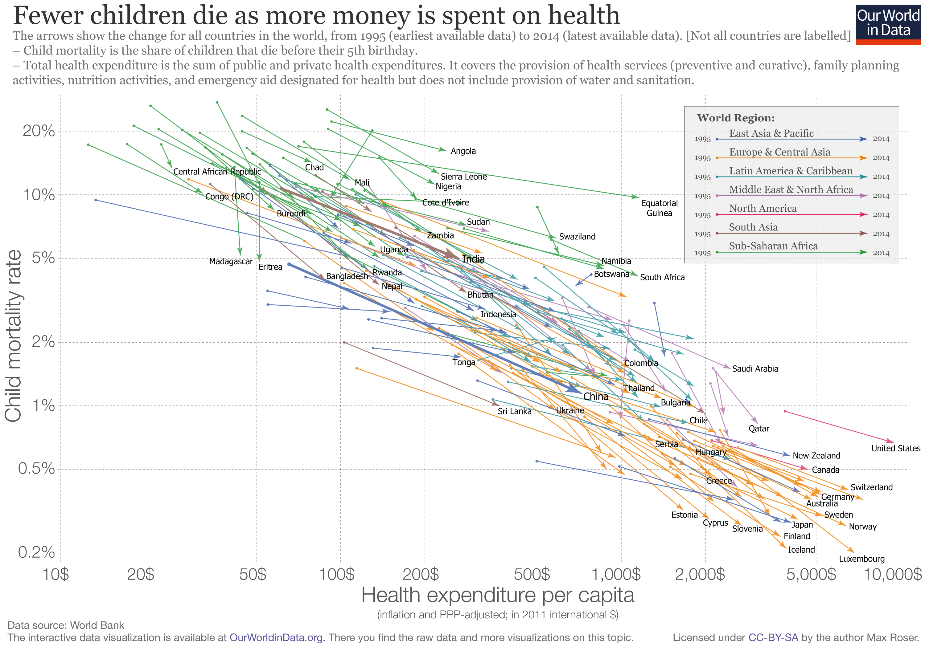
The Figure, which was brought to my attention by this Tweet by Bill Gates, shows that global child mortality rates (number of children per 1000 dying before the age of 5) and total expenditure on healthcare are negatively correlated. The lower one of these is, the higher the other. The Figure additionally shows that over time (from 1995 to 2014) child mortality rates have been declining while healthcare expenditure has been increasing.
But is there a causal link? #
Other than being an awesome data visualization, what caught my attention was that Mr. Gates said, “Here’s a great investment.” To me, this implies that by investing in healthcare, we can hope to reduce child mortality rates.
This is a tempting thought – that changes in healthcare expenditure are causing some of the changes in child mortality rates, most likely through indirect means such as providing more funds to hire hospital staff. However, the OurWorldInData.org team don’t claim this. Instead, they refer to child mortality as a “correlate” of healthcare expenditure. Why? Because any good scientist or statistician will remind you that “correlation does not imply causation.” If you’re not familiar with this concept or feel like a laugh, this site provides some amusing examples of variables that correlate but don’t cause one another. Still, correlation is an important indicator of a causal relation.
Temporal precedence as an indicator of causality #
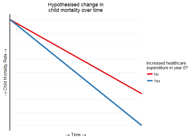
The aim of this post is to provide some empirical support for Mr. Gates’ comment and investigate whether there is evidence of the second indicator of causality: temporal precedence. A cause should always come before an effect in time. Therefore, should a causal link exist, past changes in healthcare expenditure should correspond to future changes in child mortality rates.
Imagine, for example, two countries that are identical in every way. One year (we’ll call this year 0), one country increases the amount it is spending on healthcare, but the other country does not. What would we expect to see? If there’s a causal link, then we should expect that the rates of child mortality will, over time, become lower in the country that increased its spending. This hypothesis can be visualized below.
Let’s now begin to examine whether there is evidence of this sort of temporal relationship between changes in healthcare expenditure and child mortality rates around the globe.
R code and the ourworldindata package #
From here, we’ll be using data available in the new ourworldindata package for R, which you can learn more about in a previous blogR post. Complete data is available from 1995 to 2013 for 173 countries.
Also, for those who are interested, the complete R code used in this post is available via my blogR GitHub repository.
Changes in healthcare expenditure #
To commence our investigation, we need to make sure that countries change their healthcare spending to various degrees. From the earlier Figure, global spending on healthcare has increased from 1995 to 2014. However, The Figure ignores year-to-year fluctuations that are relevant to our focus. Let’s start by examining how much spending on health for each country changed in 1996. Instead of considering the change in absolute numbers of dollars (which varies considerably between countries), we’ll consider each countries’ change in 1996 as a percentage of their 1995 expenditure, making comparisons easier. For example, the Figure below shows the countries with the most extreme changes in their healthcare expenditure relative to their spending in 1995.

We can see that Bosnia and Herzegovina increased their healthcare spending by more than 100%! That is, they more than doubled their spending on health from the previous year. Compare this to Angola, which decreased spending by over 20%.
The Figure below shows the distribution of relative changes made to healthcare expenditure in 1996 by all countries.
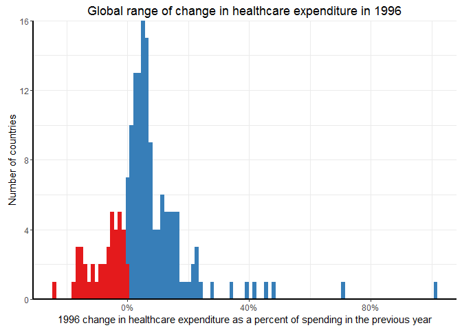
We can see that, in 1996, most countries increased their healthcare expenditure relative to the previous year (1995), with the overall average being an increase of 6.11%. Still, a noticeable proportion of countries made no change or even decreased their spending.
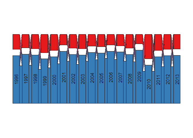
When we reduce this to increase or not, the Figure below shows the numbers of countries that increased or decreased their spending on healthcare each year.

Each year, an average of 39 countries made no change or decreased their spending on healthcare.
One thing to check is that it’s not always the same countries in each category. Therefore, the Figure below represents the same numbers while also showing the annual flow of countries between categories:
Each year, it appears that there are some countries that transition from increasing their healthcare expenditure to decreasing it, and vice versa.
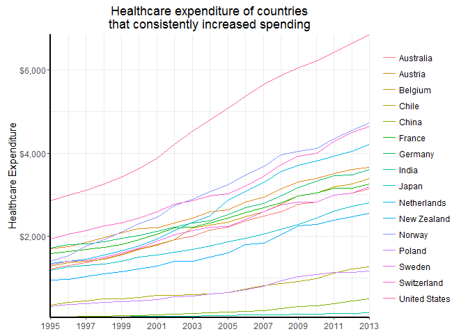
In fact, there are only 16 countries that increased their healthcare expenditure every year from 1995 to 2013. The absolute spending trajectories of these countries are shown below:
We now know that many countries have high fluctuations in the changes to healthcare spending from year to year, meaning we have sufficient data to examine the question of temporal precedence.
Investigating the effects of changing healthcare expenditure #
To investigate temporal precedence, we’ll overlay information about changes in healthcare expenditure onto Figures about relative changes in child mortality over time. We’ll start by examining changes in countries’ child mortality rates relative to their rate in 1996. In the Figure below, thin lines represent countries, and the thick bands represent world region averages.
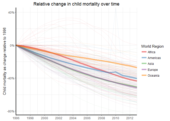
Like the earlier Figures showed, child mortality has generally been declining over time, though there are significant fluctuations within and between countries.
What happens if we overlay information about healthcare expenditure changes in 1996 instead of world region information? This time, the thick bands represent averages for countries that did, or did not, increase their spending on health in 1996.

This Figure looks a bit like our hypothesized results. A gap in child mortality opens between those countries that increased their spending on healthcare in 1996 and those that did not. This gap indicates that future child mortality is lower for countries that increased their healthcare expenditure, and this difference is largest after around ten years (in 2006).
Now, imagine doing the same comparison as above for every year from 1996 to 2003, looking ahead ten years in each case. The below Figure shows the averaged results of these comparisons, treating the starting year as year 0.
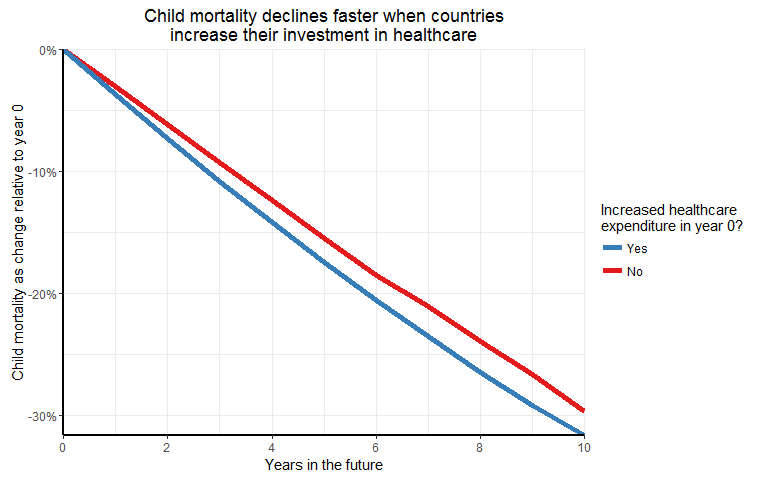
There seems to be a consistent difference in the future child mortality rates of countries that do or do not increase their healthcare expenditure in a given year. Furthermore, this difference continues to grow up to 10 years into the future!
This provides evidence of temporal precedence and, therefore, further indicates that changes in healthcare expenditure cause or lead to changes in child mortality rates. It seems intuitive, but this provides empirical evidence to support Mr. Gates’ claim that investing in healthcare truly can help to reduce child mortality rates!
Final Remarks and Limitations #
To round this post off, I’d like to remind you that there are some major limitations to the conclusions that have been drawn.
A particular concern is whether temporal precendence, as evidenced here, is a solid enough indicator of a causal relationship. The truth is that it is not. Temporal precedence is a condition that is necessary, but not sufficient, to determine that a causal relationship exists. Thus, the evidence presented here might lend support to the notion of causality, but it is far from sufficient for being confident that it exists. As a scientist, I rely on randomized and controlled experiments to establish causality. But running such an experiment with healthcare will (hopefully) never happen. In my brief but enjoyable exchange about this post with Rui Quintino after first publishing it, Rui suggested that it might be worth looking for natural experiments in the data. I fully agree, so please contact me if you’re aware of any such events.
Also, a reminder that the work produced here has not been peer-reviewed, nor have the analyses been replicated or validated by others (though, since first publishing this post, I’ve had some wonderful discussions with people like Amanda and Rui). For any other readers who are particularly concerned with the subject-matter of this post, I’d ask that you do independent work and to also feel free to contact me with any ideas you’d like to add here, or relevant work to reference.
Sign off #
Thanks for reading and I hope this was useful for you.
For updates of recent blog posts, follow @drsimonj on Twitter, or email me at drsimonjackson@gmail.com to get in touch.
If you’d like the code that produced this blog, check out the blogR GitHub repository.