ourworldindata: an R data package
@drsimonj here to introduce ourworldindata: a new data package for R.
The ourworldindata package contains data frames that are generated by combining datasets from OurWorldInData.org: “an online publication that shows how living conditions around the world are changing”. The data frames in this package have undergone tidying so that they are suited to quick analysis in R. The purpose of this package is to serve as a central R resource for these datasets so that they might be used for the likes of practice or exploratory data analysis in a replicable manner.
Thanks to the OurWorldInData team #
Before discussing the package, I’d like to express my thanks to Max Roser and the rest of the OurWorldInData team, who collate the data sets that form the foundation of this package. If you appreciate their work and make use of this package, please consider supporting OurWorldInData. Personal thanks to Max Roser for also supporting the development of this package. Max tells me that OurWorldInData is planning to develop an API to allow access to their database, so keep an eye out for this! Still, I suspect that this package will come in handy for R users.
Getting Started #
ourworldindata is currently available as a development version, which can be installed from GitHub as follows:
install.packages("devtools")  # Only needed if you don't have devtools installed
devtools::install_github("drsimonj/ourworldindata")
Once installed, you can load the package and all available data frames with:
library(ourworldindata)
A general help page is available by running the following command:
?ourworldindata
Running this code will show you a list of the available data frames and links to their help pages.
What data frames are available? #
The goal of the package is to start by providing a single and tidy data frame for each section of OurWorldInData.org. As a starting point, two data frames are available in this package:
-
child_mortalitycorresponding to the data available on the Child Mortality page. -
financing_healthcarecorresponding to the data available on the Financing Healthcare page.
As the package develops, the intention is to generate a single data frame for each section of the website. Completing this will be a rather large task, so please feel free to get in touch if there’s a particular part you’d like added to the list.
How to use a data frame #
After loading the package (via library(ourworldindata)), you can access any data frame by calling its name. For example:
child_mortality
#> # A tibble: 44,926 × 10
#>     year     country continent population child_mort survival_per_woman
#>    <int>       <chr>     <chr>      <int>      <dbl>              <dbl>
#> 1   1957 Afghanistan      Asia    9147286     378.25           4.752952
#> 2   1958 Afghanistan      Asia    9314915     372.30           4.801279
#> 3   1959 Afghanistan      Asia    9489453     366.50           4.847305
#> 4   1960 Afghanistan      Asia    9671046     360.95           4.891030
#> 5   1961 Afghanistan      Asia    9859928     355.20           4.936288
#> 6   1962 Afghanistan      Asia   10056480     349.60           4.981547
#> 7   1963 Afghanistan      Asia   10261254     344.45           5.024505
#> 8   1964 Afghanistan      Asia   10474903     339.20           5.065161
#> 9   1965 Afghanistan      Asia   10697983     333.80           5.108119
#> 10  1966 Afghanistan      Asia   10927724     328.65           5.149542
#> # ... with 44,916 more rows, and 4 more variables: deaths_per_woman <dbl>,
#> #   poverty <dbl>, education <dbl>, health_exp <dbl>
We can see that child_mortality is a tibble (just like a data frame) with 44926 rows and 10 variables.
A data frame’s help page will describe the data and its variables. Running ?child_mortality displays the help for this package that describes it as “Country-level changes in child mortality rates and related variables over time…”, followed by the variable list. For example, the variable child_mort is “Child Mortality (0-5 year-olds dying per 1,000 born)…”.
For best practice, it’s best to assign the data frame to another object before working with it. For example, if you want to add a variable such as child mortality as a proportion of the population size, it’s best to do it as follows:
d <- child_mortality
d$child_mort_prop <- d$child_mort / d$population
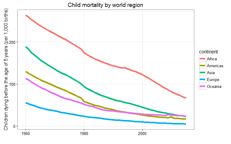
To demonstrate the use of this data set, here we will create a similar graphic to the Child mortality by world region Figure with some help from the dplyr and ggplot2 packages:
library(dplyr)
library(ggplot2)

d <- child_mortality
d %>%
  filter(year >= 1960 & !is.na(continent)) %>%
  group_by(continent, year) %>%
  summarise(child_mort = mean(child_mort, na.rm = TRUE)) %>%
  ggplot(aes(x = year, y = child_mort, color = continent)) +
    geom_line(size = 2) +
    theme_bw() +
    labs(
      title = "Child mortality by world region",
      x = "",
      y = "Children dying before the age of 5 years (per 1,000 births)"
    )
Here’s an example using the fanancial_healthcare data that replicates the 2013 frame from the Healthcare expenditure as a percentage of GDP Figure:
d <- financing_healthcare %>%
  filter(year == 2013) %>%
  select(country, health_exp_total, gdp) %>%
  na.omit() %>%
  mutate(exp_gdp = 100 * health_exp_total / gdp) %>%
  rename(region = country) %>%
  mutate(region = ifelse(region == "United States", "USA", region))

world_map <-  map_data(map = "world") %>% left_join(d)

ggplot(world_map) +
  geom_map(map = world_map, aes(map_id = region, x = long, y = lat, fill = exp_gdp)) +
  scale_fill_gradient(name = "Healthcare expenditure\nas % of GDP",
                      low = "palegreen1", high = "navyblue", na.value = "gray95") +
  coord_equal() +
  ggtitle("Total Healthcare Expenditure as Share (%) of National GDP by Country, 2013") +
  theme_void()

How is the data prepared? #
If you looked for these plots on OurWorldInData.org, you would notice that there isn’t a perfect match between the graphs. This mismatch occurs for a couple of reasons. For example, on the global map, the country names are not correctly matched between fanancial_healthcare and world_map which contains the map coordinates. To demonstrate, I had to change occasions of “United States” to “USA”. However, this isn’t a major problem if we invest some time. What is important is that the data can be slightly different between this ourworldindata package and any single data source on OurWorldInData.org, and this is a product of the process by which the data frame is prepared.
To create a particular data frame for this package (e.g., financing_healthcare), every data set available on the relevant web page is extracted and merged, and the variables are given tidy names. In some instances, the same variable (such as child mortality rate) is present in multiple data sets but with different values due to them being derived from different sources. In such instances, the variable that appears in the final data frame is computed as the mean of all available estimates. This is the main source of differences between a single data set from the website and the complete data frame in the package, and an important thing to be aware of if you’re using this package for reasons other than practice.
A final point on data preparation: If you want to know exactly how a data frame was prepared, the R script used to create it is available in the data_prep folder on GitHub. If you’d prefer to stick to values from a single source, for now, the best thing to do is download the specific data set from OurWorldInData.org and merge it to the package data frame in R.
Plans for the future and support #
Whenever I can, I’d like to continue creating tidy data frames from OurWorldInData.org and adding them to this package for public use. I might also consider adding some functions if I think that there would be a common usage for them.
If you try this package, please don’t hesitate to get in touch with me with any sort of feedback. Similarly, if you’d like to contribute directly and be a part of developing the ourworldindata package, please check out the GitHub project or get in touch with me directly.
Sign off #
Thanks for reading and I hope this was useful for you.
For updates of recent blog posts, follow @drsimonj on Twitter, or email me at drsimonjackson@gmail.com to get in touch.
If you’d like the code that produced this blog, check out the blogR GitHub repository.