Visualising Residuals
Residuals. Now there’s something to get you out of bed in the morning!
OK, maybe residuals aren’t the sexiest topic in the world. Still, they’re an essential element and means for identifying potential problems of any statistical model. For example, the residuals from a linear regression model should be homoscedastic. If not, this indicates an issue with the model such as non-linearity in the data.
This post will cover various methods for visualising residuals from regression-based models. Here are some examples of the visualisations that we’ll be creating:


What you need to know #
To get the most out of this post, there are a few things you should be aware of. Firstly, if you’re unfamiliar with the meaning of residuals, or what seems to be going on here, I’d recommend that you first do some introductory reading on the topic. Some places to get started are Wikipedia and this excellent section on Statwing.
You’ll also need to be familiar with running regression (linear and logistic) in R, and using the following packages: ggplot2 to produce all graphics, and dplyr and tidyr to do data manipulation. In most cases, you should be able to follow along with each step, but it will help if you’re already familiar with these.
What we’ve got already #
Before diving in, it’s good to remind ourselves of the default options that R has for visualising residuals. Most notably, we can directly plot() a fitted regression model. For example, using the mtcars data set, let’s regress the number of miles per gallon for each car (mpg) on their horsepower (hp) and visualise information about the model and residuals:
fit <- lm(mpg ~ hp, data = mtcars)  # Fit the model
summary(fit)  # Report the results
#>
#> Call:
#> lm(formula = mpg ~ hp, data = mtcars)
#>
#> Residuals:
#>     Min      1Q  Median      3Q     Max
#> -5.7121 -2.1122 -0.8854  1.5819  8.2360
#>
#> Coefficients:
#>             Estimate Std. Error t value Pr(>|t|)
#> (Intercept) 30.09886    1.63392  18.421  < 2e-16 ***
#> hp          -0.06823    0.01012  -6.742 1.79e-07 ***
#> ---
#> Signif. codes:  0 '***' 0.001 '**' 0.01 '*' 0.05 '.' 0.1 ' ' 1
#>
#> Residual standard error: 3.863 on 30 degrees of freedom
#> Multiple R-squared:  0.6024, Adjusted R-squared:  0.5892
#> F-statistic: 45.46 on 1 and 30 DF,  p-value: 1.788e-07

par(mfrow = c(2, 2))  # Split the plotting panel into a 2 x 2 grid
plot(fit)  # Plot the model information

par(mfrow = c(1, 1)) # Return plotting panel to 1 section
These plots provide a traditional method to interpret residual terms and determine whether there might be problems with our model. We’ll now be thinking about how to supplement these with some alternative (and more visually appealing) graphics.
General Approach #
The general approach behind each of the examples that we’ll cover below is to:
- Fit a regression model to predict variable (Y).
- Obtain the predicted and residual values associated with each observation on (Y).
- Plot the actual and predicted values of (Y) so that they are distinguishable, but connected.
- Use the residuals to make an aesthetic adjustment (e.g. red colour when residual in very high) to highlight points which are poorly predicted by the model.
Simple Linear Regression #
We’ll start with simple linear regression, which is when we regress one variable on just one other. We can take the earlier example, where we regressed miles per gallon on horsepower.
Step 1: fit the model #
First, we will fit our model. In this instance, let’s copy the mtcars dataset to a new object d so we can manipulate it later:
d <- mtcars
fit <- lm(mpg ~ hp, data = d)
Step 2: obtain predicted and residual values #
Next, we want to get predicted and residual values to add supplementary information to this graph. We can do this as follows:
d$predicted <- predict(fit)   # Save the predicted values
d$residuals <- residuals(fit) # Save the residual values

# Quick look at the actual, predicted, and residual values
library(dplyr)
d %>% select(mpg, predicted, residuals) %>% head()
#>                    mpg predicted  residuals
#> Mazda RX4         21.0  22.59375 -1.5937500
#> Mazda RX4 Wag     21.0  22.59375 -1.5937500
#> Datsun 710        22.8  23.75363 -0.9536307
#> Hornet 4 Drive    21.4  22.59375 -1.1937500
#> Hornet Sportabout 18.7  18.15891  0.5410881
#> Valiant           18.1  22.93489 -4.8348913
Looking good so far.
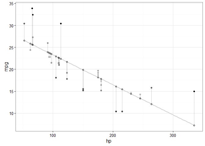
Step 3: plot the actual and predicted values #
Plotting these values takes a couple of intermediate steps. First, we plot our actual data as follows:
library(ggplot2)
ggplot(d, aes(x = hp, y = mpg)) +  # Set up canvas with outcome variable on y-axis
  geom_point()  # Plot the actual points

Next, we plot the predicted values in a way that they’re distinguishable from the actual values. For example, let’s change their shape:
ggplot(d, aes(x = hp, y = mpg)) +
  geom_point() +
  geom_point(aes(y = predicted), shape = 1)  # Add the predicted values

This is on track, but it’s difficult to see how our actual and predicted values are related. Let’s connect the actual data points with their corresponding predicted value using geom_segment():
ggplot(d, aes(x = hp, y = mpg)) +
  geom_segment(aes(xend = hp, yend = predicted)) +
  geom_point() +
  geom_point(aes(y = predicted), shape = 1)

We’ll make a few final adjustments:
- Clean up the overall look with
theme_bw(). - Fade out connection lines by adjusting their
alpha. - Add the regression slope with
geom_smooth():
library(ggplot2)
ggplot(d, aes(x = hp, y = mpg)) +
  geom_smooth(method = "lm", se = FALSE, color = "lightgrey") +  # Plot regression slope
  geom_segment(aes(xend = hp, yend = predicted), alpha = .2) +  # alpha to fade lines
  geom_point() +
  geom_point(aes(y = predicted), shape = 1) +
  theme_bw()  # Add theme for cleaner look

Step 4: use residuals to adjust #
Finally, we want to make an adjustment to highlight the size of the residual. There are MANY options. To make comparisons easy, I’ll make adjustments to the actual values, but you could just as easily apply these, or other changes, to the predicted values. Here are a few examples building on the previous plot:
# ALPHA
# Changing alpha of actual values based on absolute value of residuals
ggplot(d, aes(x = hp, y = mpg)) +
  geom_smooth(method = "lm", se = FALSE, color = "lightgrey") +
  geom_segment(aes(xend = hp, yend = predicted), alpha = .2) +

  # > Alpha adjustments made here...
  geom_point(aes(alpha = abs(residuals))) +  # Alpha mapped to abs(residuals)
  guides(alpha = FALSE) +  # Alpha legend removed
  # <

  geom_point(aes(y = predicted), shape = 1) +
  theme_bw()
# COLOR
# High residuals (in abolsute terms) made more red on actual values.
ggplot(d, aes(x = hp, y = mpg)) +
  geom_smooth(method = "lm", se = FALSE, color = "lightgrey") +
  geom_segment(aes(xend = hp, yend = predicted), alpha = .2) +

  # > Color adjustments made here...
  geom_point(aes(color = abs(residuals))) + # Color mapped to abs(residuals)
  scale_color_continuous(low = "black", high = "red") +  # Colors to use here
  guides(color = FALSE) +  # Color legend removed
  # <

  geom_point(aes(y = predicted), shape = 1) +
  theme_bw()

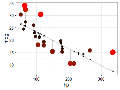
# SIZE AND COLOR
# Same coloring as above, size corresponding as well
ggplot(d, aes(x = hp, y = mpg)) +
  geom_smooth(method = "lm", se = FALSE, color = "lightgrey") +
  geom_segment(aes(xend = hp, yend = predicted), alpha = .2) +

  # > Color AND size adjustments made here...
  geom_point(aes(color = abs(residuals), size = abs(residuals))) + # size also mapped
  scale_color_continuous(low = "black", high = "red") +
  guides(color = FALSE, size = FALSE) +  # Size legend also removed
  # <

  geom_point(aes(y = predicted), shape = 1) +
  theme_bw()
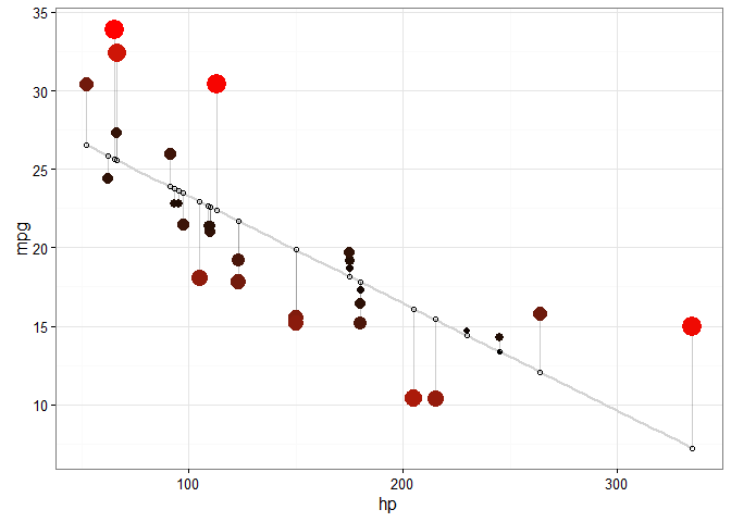
# COLOR UNDER/OVER
# Color mapped to residual with sign taken into account.
# i.e., whether actual value is greater or less than predicted
ggplot(d, aes(x = hp, y = mpg)) +
  geom_smooth(method = "lm", se = FALSE, color = "lightgrey") +
  geom_segment(aes(xend = hp, yend = predicted), alpha = .2) +

  # > Color adjustments made here...
  geom_point(aes(color = residuals)) +  # Color mapped here
  scale_color_gradient2(low = "blue", mid = "white", high = "red") +  # Colors to use here
  guides(color = FALSE) +
  # <

  geom_point(aes(y = predicted), shape = 1) +
  theme_bw()

I particularly like this last example, because the colours nicely help to identify non-linearity in the data. For example, we can see that there is more red for extreme values of hp where the actual values are greater than what is being predicted. There is more blue in the centre, however, indicating that the actual values are less than what is being predicted. Together, this suggests that the relationship between the variables is non-linear, and might be better modelled by including a quadratic term in the regression equation.
Multiple Regression #
Let’s crank up the complexity and get into multiple regression, where we regress one variable on two or more others. For this example, we’ll regress Miles per gallon (mpg) on horsepower (hp), weight (wt), and displacement (disp).
# Select out data of interest:
d <- mtcars %>% select(mpg, hp, wt, disp)

# Fit the model
fit <- lm(mpg ~ hp + wt+ disp, data = d)

# Obtain predicted and residual values
d$predicted <- predict(fit)
d$residuals <- residuals(fit)

head(d)
#>                    mpg  hp    wt disp predicted  residuals
#> Mazda RX4         21.0 110 2.620  160  23.57003 -2.5700299
#> Mazda RX4 Wag     21.0 110 2.875  160  22.60080 -1.6008028
#> Datsun 710        22.8  93 2.320  108  25.28868 -2.4886829
#> Hornet 4 Drive    21.4 110 3.215  258  21.21667  0.1833269
#> Hornet Sportabout 18.7 175 3.440  360  18.24072  0.4592780
#> Valiant           18.1 105 3.460  225  20.47216 -2.3721590
Let’s create a relevant plot using ONE of our predictors, horsepower (hp). Again, we’ll start by plotting the actual and predicted values. In this case, plotting the regression slope is a little more complicated, so we’ll exclude it to stay on focus.
ggplot(d, aes(x = hp, y = mpg)) +
  geom_segment(aes(xend = hp, yend = predicted), alpha = .2) +  # Lines to connect points
  geom_point() +  # Points of actual values
  geom_point(aes(y = predicted), shape = 1) +  # Points of predicted values
  theme_bw()

Again, we can make all sorts of adjustments using the residual values. Let’s apply the same changes as the last plot above - with blue or red for actual values that are greater or less than their predicted values:
ggplot(d, aes(x = hp, y = mpg)) +
  geom_segment(aes(xend = hp, yend = predicted), alpha = .2) +
  geom_point(aes(color = residuals)) +
  scale_color_gradient2(low = "blue", mid = "white", high = "red") +
  guides(color = FALSE) +
  geom_point(aes(y = predicted), shape = 1) +
  theme_bw()
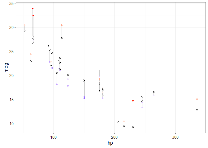
So far, there’s not anything new in our code. All that has changed in that the predicted values don’t line up neatly because we’re now doing multiple regression.
Plotting multiple predictors at once #
Plotting one independent variable is all well and good, but the whole point of multiple regression is to investigate multiple variables!
To visualise this, we’ll make use of one of my favourite tricks: using the tidyr package to gather() our independent variable columns, and then use facet_*() in our ggplot to split them into separate panels. For relevant examples, see here, here, or here.
Let’s recreate the last example plot, but separately for each of our predictor variables.
d %>%
  gather(key = "iv", value = "x", -mpg, -predicted, -residuals) %>%  # Get data into shape
  ggplot(aes(x = x, y = mpg)) +  # Note use of `x` here and next line
  geom_segment(aes(xend = x, yend = predicted), alpha = .2) +
  geom_point(aes(color = residuals)) +
  scale_color_gradient2(low = "blue", mid = "white", high = "red") +
  guides(color = FALSE) +
  geom_point(aes(y = predicted), shape = 1) +
  facet_grid(~ iv, scales = "free_x") +  # Split panels here by `iv`
  theme_bw()

Let’s try this out with another data set. We’ll use the iris data set, and regress Sepal.Width on all other continuous variables (aside, thanks to Hadley Wickham’s suggestion to drop categorical variables for plotting):
d <- iris %>% select(-Species)

# Fit the model
fit <- lm(Sepal.Width ~ ., data = iris)

# Obtain predicted and residual values
d$predicted <- predict(fit)
d$residuals <- residuals(fit)

# Create plot
d %>%
  gather(key = "iv", value = "x", -Sepal.Width, -predicted, -residuals) %>%
  ggplot(aes(x = x, y = Sepal.Width)) +
  geom_segment(aes(xend = x, yend = predicted), alpha = .2) +
  geom_point(aes(color = residuals)) +
  scale_color_gradient2(low = "blue", mid = "white", high = "red") +
  guides(color = FALSE) +
  geom_point(aes(y = predicted), shape = 1) +
  facet_grid(~ iv, scales = "free_x") +
  theme_bw()
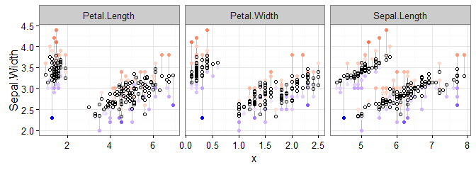
To make this plot, after the regression, the only change to our previous code was to change mpg to Sepal.Width in two places: the gather() and ggplot() lines.
We can now see how the actual and predicted values compare across our predictor variables. In case you’d forgotten, the coloured points are the actual data, and the white circles are the predicted values. With this in mind, we can see, as expected, that there is less variability in the predicted values than the actual values..
Logistic Regression #
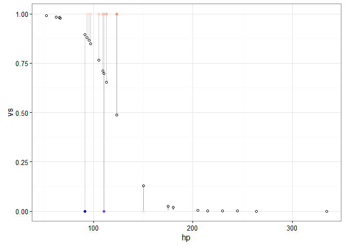
To round this post off, let’s extend our approach to logistic regression. It’s going to require the same basic workflow, but we will need to extract predicted and residual values for the responses. Here’s an example predicting V/S (vs), which is 0 or 1, with hp:
# Step 1: Fit the data
d <- mtcars
fit <- glm(vs ~ hp, family = binomial(), data = d)

# Step 2: Obtain predicted and residuals
d$predicted <- predict(fit, type="response")
d$residuals <- residuals(fit, type = "response")

# Steps 3 and 4: plot the results
ggplot(d, aes(x = hp, y = vs)) +
  geom_segment(aes(xend = hp, yend = predicted), alpha = .2) +
  geom_point(aes(color = residuals)) +
  scale_color_gradient2(low = "blue", mid = "white", high = "red") +
  guides(color = FALSE) +
  geom_point(aes(y = predicted), shape = 1) +
  theme_bw()
If we only want to flag cases that would be scored as the incorrect category, we can do something like the following (with some help from the dplyr function, filter()):
ggplot(d, aes(x = hp, y = vs)) +
  geom_segment(aes(xend = hp, yend = predicted), alpha = .2) +
  geom_point() +

  # > This plots large red circle on misclassified points
  geom_point(data = d %>% filter(vs != round(predicted)),
             color = "red", size = 2) +
  # <

  scale_color_gradient2(low = "blue", mid = "white", high = "red") +
  guides(color = FALSE) +
  geom_point(aes(y = predicted), shape = 1) +
  theme_bw()

I’ll leave it to you to combine this with instructions from the previous sections if you’d like to extend it to multiple logistic regression. But, hopefully, you should now have a good idea of the steps involved and how to create these residual visualisations!
Bonus: using broom #
After recieving the same helpful suggestion from aurelien ginolhac and Ilya Kashnitsky (my thanks to both of them), this section will briefly cover how to implement the augment() function from the broom package for Step 2 of the above.
The broom package helps to “convert statistical analysis objects from R into tidy data frames”. In our case, augment() will convert the fitted regression model into a dataframe with the predicted (fitted) and residual values already available.
A complete example using augment() is shown below. However, there are a couple of important differences about the data returned by augment() compared to the earlier approach to note:
- The names of the predicted and residual values are
.fittedand.resid - There are many additional variables that we gain access to. These need to be dropped if you wish to implement the
gather()andfacet_*()combination described earlier.
library(broom)

# Steps 1 and 2
d <- lm(mpg ~ hp, data = mtcars) %>%
       augment()

head(d)
#>           .rownames  mpg  hp  .fitted   .se.fit     .resid       .hat
#> 1         Mazda RX4 21.0 110 22.59375 0.7772744 -1.5937500 0.04048627
#> 2     Mazda RX4 Wag 21.0 110 22.59375 0.7772744 -1.5937500 0.04048627
#> 3        Datsun 710 22.8  93 23.75363 0.8726286 -0.9536307 0.05102911
#> 4    Hornet 4 Drive 21.4 110 22.59375 0.7772744 -1.1937500 0.04048627
#> 5 Hornet Sportabout 18.7 175 18.15891 0.7405479  0.5410881 0.03675069
#> 6           Valiant 18.1 105 22.93489 0.8026728 -4.8348913 0.04317538
#>     .sigma      .cooksd .std.resid
#> 1 3.917367 0.0037426122 -0.4211862
#> 2 3.917367 0.0037426122 -0.4211862
#> 3 3.924793 0.0017266396 -0.2534156
#> 4 3.922478 0.0020997190 -0.3154767
#> 5 3.927667 0.0003885555  0.1427178
#> 6 3.820288 0.0369380489 -1.2795289

# Steps 3 and 4
ggplot(d, aes(x = hp, y = mpg)) +
  geom_smooth(method = "lm", se = FALSE, color = "lightgrey") +
  geom_segment(aes(xend = hp, yend = .fitted), alpha = .2) +  # Note `.fitted`
  geom_point(aes(alpha = abs(.resid))) +  # Note `.resid`
  guides(alpha = FALSE) +
  geom_point(aes(y = .fitted), shape = 1) +  # Note `.fitted`
  theme_bw()
Sign off #
Thanks for reading and I hope this was useful for you.
For updates of recent blog posts, follow @drsimonj on Twitter, or email me at drsimonjackson@gmail.com to get in touch.
If you’d like the code that produced this blog, check out the blogR GitHub repository.