Pretty histograms with ggplot2
@drsimonj here to make pretty histograms with ggplot2!
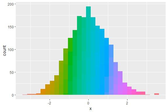
In this post you’ll learn how to create histograms like this:

The data #
Let’s simulate data for a continuous variable x in a data frame d:
set.seed(070510)
d <- data.frame(x = rnorm(2000))

head(d)
#>            x
#> 1  1.3681661
#> 2 -0.0452337
#> 3  0.0290572
#> 4 -0.8717429
#> 5  0.9565475
#> 6 -0.5521690
Basic Histogram #
Create the basic ggplot2 histogram via:
library(ggplot2)

ggplot(d, aes(x)) +
    geom_histogram()

Adding Colour #
Time to jazz it up with colour! The method I’ll present was motivated by my answer to this StackOverflow question.
We can add colour by exploiting the way that ggplot2 stacks colour for different groups. Specifically, we fill the bars with the same variable (x) but cut into multiple categories:
ggplot(d, aes(x, fill = cut(x, 100))) +
    geom_histogram()

What the…
Oh, ggplot2 has added a legend for each of the 100 groups created by cut! Get rid of this with show.legend = FALSE:
ggplot(d, aes(x, fill = cut(x, 100))) +
    geom_histogram(show.legend = FALSE)
Not a bad starting point, but say we want to tweak the colours.
For a continuous colour gradient, a simple solution is to include scale_fill_discrete and play with the range of hues. To get your colours right, get familiar with the hue scale.
For example, here we’ll tweak the colours to range from blue to red:
ggplot(d, aes(x, fill = cut(x, 100))) +
  geom_histogram(show.legend = FALSE) +
  scale_fill_discrete(h = c(240, 10))
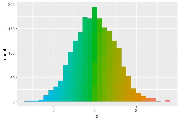
Seems a little dark. Tweak chroma and luminance with c and l:
ggplot(d, aes(x, fill = cut(x, 100))) +
  geom_histogram(show.legend = FALSE) +
  scale_fill_discrete(h = c(240, 10), c = 120, l = 70)

Final touches #
The final touches are to set the theme, add labels, and a title:
ggplot(d, aes(x, fill = cut(x, 100))) +
  geom_histogram(show.legend = FALSE) +
  scale_fill_discrete(h = c(240, 10), c = 120, l = 70) +
  theme_minimal() +
  labs(x = "Variable X", y = "n") +
  ggtitle("Histogram of X")

Now have fun tweaking the colours!
p <- ggplot(d, aes(x, fill = cut(x, 100))) +
  geom_histogram(show.legend = FALSE) +
  theme_minimal() +
  labs(x = "Variable X", y = "n") +
  ggtitle("Histogram of X")

p + scale_fill_discrete(h = c(180, 360), c = 150, l = 80)

p + scale_fill_discrete(h = c(90, 210), c = 30, l = 50)

Sign off #
Thanks for reading and I hope this was useful for you.
For updates of recent blog posts, follow @drsimonj on Twitter, or email me at drsimonjackson@gmail.com to get in touch.
If you’d like the code that produced this blog, check out the blogR GitHub repository.